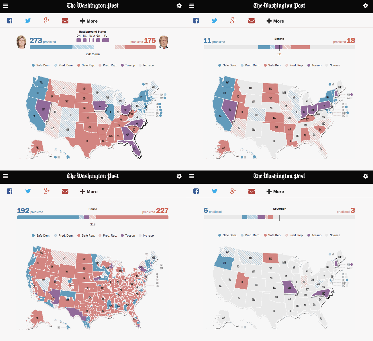
This week we finally got the chance to show some of the tools that The Washington Post will use to cover election results in November, live on The Post’s website.
On Tuesday, The Washington Post and SurveyMonkey released a comprehensive presidential poll of all 50 states. Alongside this ambitious polling effort, The Post also rolled out preview pages detailing the Presidential, Senate, House, and Gubernatorial races across all 50 states and Washington DC. These pages show the current state of the race and offer predictions and historic results.

The maps on these pages lean on much of the technology and workflows that we are developing for Election Day. To render maps, we make heavy use of Mapbox GL JS, an open-source mapping library that uses your graphics processor to draw fast, highly detailed maps — borrowing from technologies that render detailed video game universes.
This framework provides cutting-edge hardware acceleration to draw beautiful maps that effortlessly accommodate highly interactive input from Washington Post readers. However, making WebGL maps work for live reporting an election on a major national news site presented a number of interesting challenges:
-
Albers US projection To make the coverage work with US-centric elections, we employed a method called* “Lying to Leaflet,” inserting the more appropriate Albers USA projection, in place of the default Web Mercator. You can use this method to show other projections, for example the polar projection to map artic ice.
-
Dynamic sources Although not required for preview pages, the real-time election data on Election Day will require us to join data to vector tiles “on the fly” before feeding these to Mapbox GL to render. We are doing this for preview pages today in order to test and optimize our data pipeline in advance of November.
-
Reactive updates We employ a reactive programming design pattern to build the code around Mapbox GL. This allows us to keep program state in one central location and only respond to necessary changes, including using a “style diff” to update the maps. A recent Mapbox blog post further describes this approach.
-
Shared rendering resources The Post’s expansive coverage requires us to load several maps concurrently on the same webpage, in main views and in small multiples. By using a shared pool of web workers, we minimized the overhead for faster loading.
-
Independent components with a central driver At the same time, we often need maps to behave independently. Components must be maximally flexible, embeddable on pages we don’t control, and usable in a number of configurations. To do this, we created a central, application-wide, reducer-based store. This allows the Post to create pages with an arbitrary number of components without too much orchestration.
-
Image-based fallbacks Though WebGL support is already high and climbing, a small percentage of users on older browsers don’t have access. To serve these users, we are building a workflow that generates static images directly from our Mapbox GL pipeline. This ensures that all users can see the most recent data no matter their browser.
As this election season progresses, The Post will provide contextual, historical, and demographic data while updating its predictions. In parallel, we will refine and test our approach to make sure it provides powerful data on what will certainly be an interesting election.
 Small multiples in a box.
*h/t Seth Fitzsimmons of Stamen Design.
What we're doing.
Latest
