
Working with Internews and their on-the-ground partner NAI, we just relaunched data.nai.org.af, a 12 year report on incidents of violence against journalists in Afghanistan. The new site replaces maps that were rendered in TileMill with markers that dynamically load data from a Google Doc spreadsheet, making it easier to maintain the site and publish the latest reports of violence.
This simple workflow helps NAI work more efficiently, as noted by Abdul Mujeeb Khalvatgar, Executive Director of the Afghan Media Advocacy Group at NAI:
Collecting and publishing reports in realtime is going to help us have a more public conversation about protecting media freedom and will help us resolve the problem in its soonest possible time.
How it works
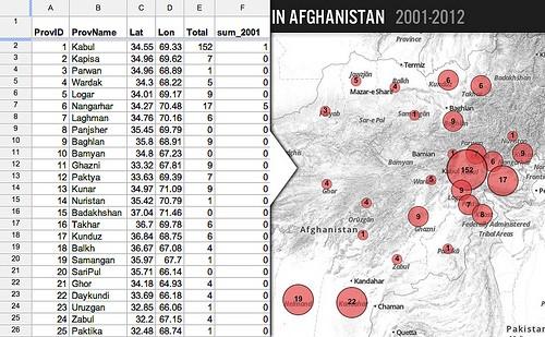
Setting up the data source is simple: Google provides a spreadsheet API that gives us access to the data in published spreadsheets through a jsonp feed. On the back end, NAI staff enter reports into a web form that feeds into a shared Google Spreadsheet. Then on the webpage, we have JavaScript asynchronously load data from two sheets in the spreadsheet. The first is a list of reports, and the second is a pivot table that automatically summarizes the reports by the province.
Using markers.js, which is now a part of the new MapBox.js JavaScript API, we turn the rows for each province in the sheet powered by the pivot table into scaled circle markers on the map that represent the number of reports per each province. Hovering over or touching a marker shows a time-series line graph of the last decade of reports.
All of the reports are presented in a filterable and sortable table. Clicking on a year reveals a full list of the reports of violence that occurred, and clicking on a province filters that list.
Below the map, we dynamically build graphs of the total reports over the last decade and a breakout of types of violence per gender. We also calculate some top-level statistics like highest province, highest month, and the top organizations experiencing violence.
Since the data is all pulled live from the spreadsheet API, new reports show up on the site and are factored into the calculated totals as soon as they are entered and approved.
Building your own Google Spreadsheet-powered maps
Using the open source mapping tools from MapBox with Google’s Spreadsheet API is an easy way to build a custom map with dynamic source. Here are some resources to get you started:
-
Convert rows in a spreadsheet to geojson features for use with MapBox.js
-
Creating forms for Google Spreadsheets. Note: if you don’t require authentication on your form, you can copy its HTML source to your own webpage and style it as you wish. The form will still submit back to Google. You can go further with using an ajax
postrequest dynamically submit data to your spreadsheet from you javascript code. Just use thenameattributes on each input field as the keys for yourpostdata.
What we're doing.
Latest