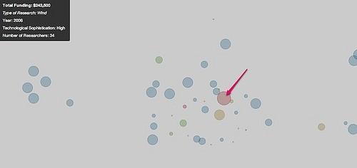
I just posted a step-by-step tutorial on support.mapbox.com that shows how fast you can generate interactive overlays with point data using TileMill. Using a hypothetical data set of Department of Energy-funded research projects and their geographic locations, the tutorial shows how to create an overlay of projects as points that tell a story based on the values of the projects, such as type of research, year funded and amount of funding.
The result is a map like this:

The documentation also goes into some technical styling considerations for thematic overlays. Specifically, I discuss varying the radius and coloring of points to distinguish different values, varying point size by zoom level, and using background data sets to flesh out the context surrounding your data set.
If you have any questions about map design or anything else related to TileMill, please start a discussion on support.mapbox.com.
What we're doing.
Latest