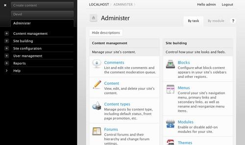
Admin 2 provides a versatile, pluggable UI for administrative tools in Drupal and is complemented by a new theme Rubik that radically reduces visual noise. Alpha releases are available for users interested in testing. This code is very new, so please be prudent using and deploying these projects.

Admin theme accompanied by Rubik
Admin 2: A pluggable framework for admin tools
Admin 2 provides an interface for other developers to leverage when implementing administrative tools. Supporting the administrative tools in modules like devel and localization client required a fresh start but were heavily influenced by
-
Key contrib projects like Administration menu by Daniel Kudwien and Navigate by Chris Shattuck
-
The D7UX work of Mark Boulton and Leisa Reichelt
-
Feedback from users and my colleagues at Development Seed, including conversations with Eric from years ago over lunch : )

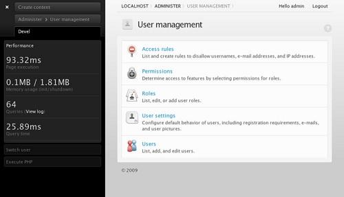
Devel components in Admin 2
The result is a toolbar that offers
-
Pluggable tools via plain old Drupal blocks. Blocks that declare in hook_block() that they are usable with admin can be added or removed from the toolbar.
-
Versatile layout and position. The toolbar can be collapsed to any corner of the screen and displayed horizontally or vertically to accommodate different themes and screen sizes.
-
Inclusion of a variety of sensible defaults in CSS and javascript — traversible menu trees, accordian/tabbed panes depending on the toolbar layout.
Rubik: Less noise, more signal
Rubik is a new admin theme that started as an implementation of the D7UX team’s designs (for a direct adaptation, see the backported D7 admin theme Seven). It has since grown in its own direction to include some experimental changes that focus on reducing visual noise:
-
Hidden form item descriptions until a user hovers over an element.
-
Pushing fieldset collapsers/expanders out into the margin that makes it easy to scan and spot the next major set of options.
-
Aggressive templating and consolidation for many Drupal core forms.
Callibrating icons to the task at hand
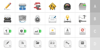
A particularly strong influence on the new icons in Rubik was an idea from KDE Oxygen — to vary color saturation by the importance of the task presented to the user:
“Normal” colors … are used mostly for mimetypes, folders, system applications, and actions. Vibrant colors are more saturated and used to emphasize important action icons on a toolbar, for rich media mimetypes, for application icons and, generally speaking, used when there is need to focus the attention of the use on a particular element, helping the user to find his way by following a “subliminal” color language.
While it may sound overly theoretical (I remember thinking this myself when reading the idea for the first time a few years ago), in practice it is spot on: imagine the chaos that would occur if your file and folder icons were as bold as the “Firefox” icon.

Rubik applies this idea to Drupal and begins categorizing administrative pages into several groups:
-
Essential content management and system management pages
-
Build/task pages where you create or manipulate new site building structures
-
Informative pages like reports or logs
-
Configuration pages where users adjust settings
The end result is a much more balanced set of icons where the most common and critical administrative tasks stand out visually from the rest.
Next steps
A screencast with a bit more developer information about the guts of these projects is available here.
In the coming weeks I’ll be working hard on these projects to get them to a stable point for general use as well as working with the maintainers of devel and localization client to integrate their UI components into the admin toolbar.
What we're doing.
Latest