


Satellite data doesn’t just show what’s already burned. It can help us understand how a wildfire moves. Our new Fire Event Explorer, part of NASA’s VEDA ecosystem, gives communities and analysts a way to visualize wildfires as they unfold.

What if we could see the growth of a fire event and the conditions behind it, and not just the damage left behind?
With climate change, destructive wildfires are becoming increasingly common, so this question is more important now than ever. Remote sensing can help communities both respond to and prepare for these potentially deadly events.
These events aren’t in static satellite images, but in motion. Visualizing burn areas, fire perimeters, and wind conditions across time generates a story. It's an unfolding narrative that people on the ground are experiencing, but that may be less visible to decision makers elsewhere.
Introducing the Fire Event Explorer
Today, we’re sharing the first version of that idea:
👉 A new Fire Event Explorer on the VEDA Dashboard
It’s lightweight, open source, and built to support exploration and storytelling around wildfire behavior in the U.S.
Developed in collaboration with NASA IMPACT, the VEDA Dashboard is a storytelling tool that emphasizes geospatial data. The groundwork laid by this project allowed us to develop and publish this tool much faster than if we had started from scratch.
NASA's VEDA Dashboard allows us to build and connect multiple tools, making it the perfect home for science-specific visualization tools.
The Challenge of Understanding Fires
As we’ve worked with NASA’s Wildfire Tracking Lab team over the past couple of years, we’ve heard a common theme: We need faster ways to explore what happened.
- How did a fire grow over time?
- What direction was the wind moving?
- What can satellites tell us about the behavior of an ongoing fire?
- How does this event compare to previous fires in the area?
These aren’t just scientific questions. They’re deeply practical; informing public safety briefings, air quality alerts, emergency response coordination, and local media outlets.
As expected, there is a lot of interest in understanding fire activity and effects at the moment. Some tools, like Watch Duty, are more intended for active fire awareness and alerts. Other tools, such as FIRMS, a joint effort by NASA and the USDA Forest Service, are invaluable for the fire research community.
We haven’t seen browser-based tools that visualize fire perimeter growth over time using authoritative historical data—especially not with dynamic inputs like wind. In 2025, people should not have to write code to visualize satellite data on fire activity. The Fire Event Explorer will save scientists time and increase awareness of fire activity across the country.
With all these potential users, the need for more nimble visualizations has emerged. Data is only as useful as it is accessible. Existing tools and APIs give rapid and flexible access to scientists, but risk leaving out the broader group of decision makers who rely on clear, timely visuals.
So we built a tool designed to engage the wider fire community. We want local policymakers, forest managers, reporters, and others interested in wildfire dynamics to explore and apply this tool in their work on climate resilience.
Tempest McCabe, PhD, NASA GSFC said about the tool, "Fires evolve fast, and there are a lot of them. Preparing visualizations per-fire took too much of the team's time, and only reached a few communities. This tool lets us scale our science communication efforts across all the fires we are tracking, and supports more communities than we could accommodate on our own."
This tool lets us scale our science communication efforts.
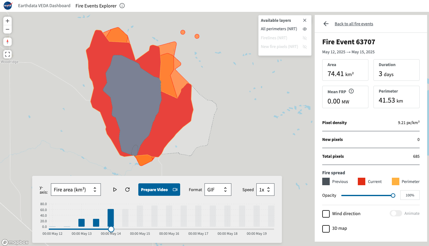
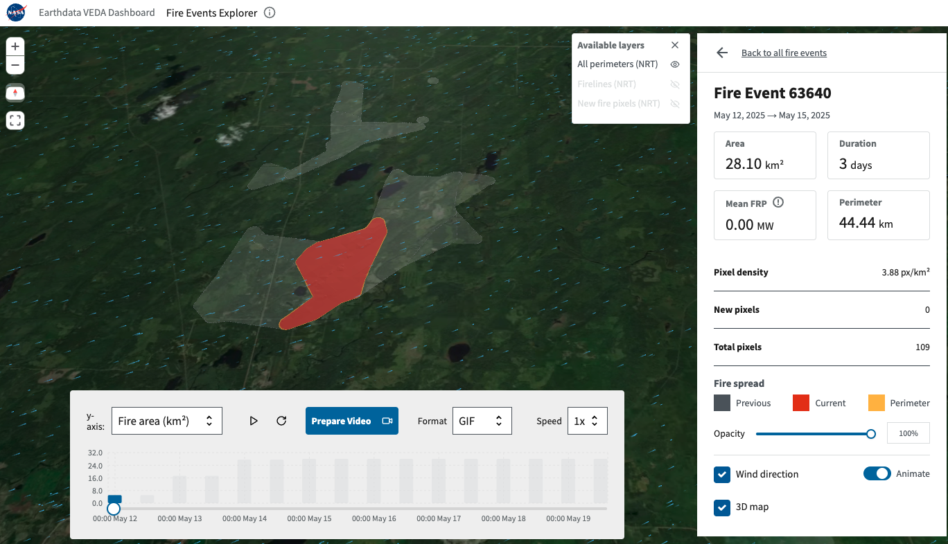
What You Can Explore
At its core, the tool is an interactive map with a few powerful layers:
- Fire affected areas for every wildfire in the country, mapped from satellites and updated regularly
- Burned area footprints, showing fire progression over time
- Wind patterns, animated alongside fire data to show direction and speed
You can zoom, pan, change dates, toggle layers, and even generate your own video recording for sharing.
More than just data on a screen, it is a satellite’s perspective of wildfire progression. A perspective that can help us understand wildfires and prepare for them in the future.
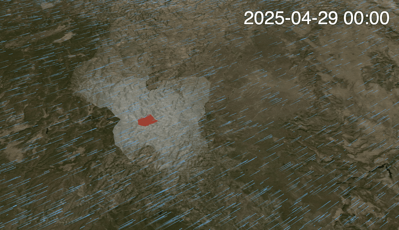
This GIF was generated directly from the Fire Event Explorer, including the wind layer.
How It’s Built
Achieving a smooth browser visualization without large file downloads or special hardware was a major challenge.
Here’s how VEDA, eoAPI, and essential data work from NASA made it possible:
- Cloud-native fire data, made accessible through VEDA’s data store and eoAPI
- Wind animation, powered by GRIB meteorological data, parsed and rendered efficiently
- Frontend stack using React, deck.gl, and vector tiles for fast, responsive visuals
- Open-source architecture, with modular layer logic and reusable UI components
VEDA’s Fire Event Explorer is part of a growing family of tools on the VEDA Dashboard, all designed to help people more easily explore climate and environmental data.
The Fire Event Explorer frontend is built with React and Deck.gl, styled using USWDS theming. The tool is bootstrapped with Vite and can also be built in library mode for use as a standalone React component, making integration into other platforms or React apps straightforward. We designed the tool around cloud-native access patterns. Fire perimeters and new detections are sourced from VIIRS-based STAC collections and streamed into the browser as vector tiles. In this way, this tool can become a useful example of how to efficiently map event-based vector data at scale in the browser.
There are some additional features worth mentioning, because they required some interesting development work.
1. Generating Wind Animations
NOAA's High Resolution Rapid Refresh (HRRR) dataset is updated hourly for the contiguous United States and Alaska. It contains rich forecast (48 hour) data as well as an historical archive that we can query to match fire conditions at a point in time with the corresponding real-time weather observations. HRRR data come in GRIB2 files, which are tough to work with—but, as with many legacy formats, GDAL’s got a driver for that.
The GDAL GRIB driver makes it possible for TiTiler (our raster visualization software) to read the exact bytes we need to visualize the wind speed data. For more TiTiler + HRRR magic check out our demo project NOAA HRRR Browser for an interactive radar viewer.
To visualize this wind layer in the Fire Event Explorer, we feed U and V wind components retrieved from the Amazon Sustainability Data Initiative (ASDI) STAC API directly into a particle-based animation layer in Deck.gl. This allows us to animate wind fields in real time alongside fire data, giving users a richer sense of how wind might be influencing fire spread. Users can also toggle between static wind arrows and animated particles depending on their needs, whether for analysis or communication.
2. Recording Videos with 3D Terrain
For visualizing the data with a 3D terrain, we use global terrain elevation data from Mapzen’s Terrain Tiles (part of ASDI). These Terrain-spec tiles provide bare-earth elevation data that we render directly in the browser using Deck.gl’s TerrainLayer without requiring custom backends or large downloads.
When a fire is selected, the tool shows a composite layer representing the fire’s full temporal evolution. This includes three states: the historical spread, the currently burning area (as defined by the slider's current position), and upcoming spread based on the most recent detections. This helps tell a clearer story about how the fire has progressed over time.
Users can then record animations directly in the browser. The tool supports export to WebM and GIF using a browser-based WebM encoder and the GIFBuilder from loaders.gl. Everything is encoded client-side, so the video never leaves the device. Timestamps for each fire event are embedded within the recording to support context-rich sharing.
With climate change, destructive wildfires are becoming increasingly common.
What's Next
This is only our first release. We’d love your input on what to build next. Some ideas we are already working on include:
- Historical comparisons, to analyze fire behavior across years or seasons
- More recording options, including higher-resolution outputs and shareable links
- Community contributions, with a focus on extensibility and collaboration
You can browse the code on GitHub, submit issues, suggest new data layers, or fork it into a tool of your own.
If you’re interested in learning more about the data, or the science behind it, visit the docs for the Wildfire Tracking Lab.
Help Us Make It Better
We believe tools like this are most powerful when shaped by the people who use them.
If you’re working with wildfire data, communicating risk, or just curious how these maps might support your work, we’d love your feedback.
Try the tool → VEDA’s Fire Event Explorer
Contribute → GitHub Repo
Get in touch → contact@developmentseed.org
Let’s keep building tools that make climate data more transparent, timely, and useful, together.
What we're doing.
Latest