Changes in census tracts make it hard to compare data over time. We are using this new vizualzation tool to understand census tract changes for a project on Illionois longitudinal data. Clicking on blue-outlined 2010 tracts reveals the 2000 tracts that were revised, merged or split to make the new tract. We can also see what percentage of the area and population of the old tract contributes to the new tract. This provides insight on how to weight data to understand changes in population and place over time.
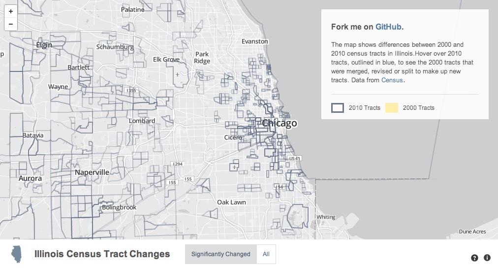
Although designed to be “relatively permanent over time”, thousands of the 74,000 change every ten years due to changes in population, geography names and a dozen other reasons.
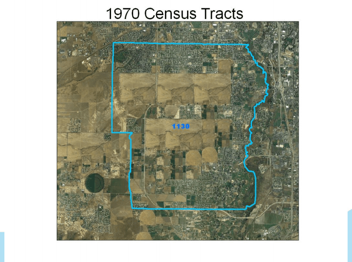
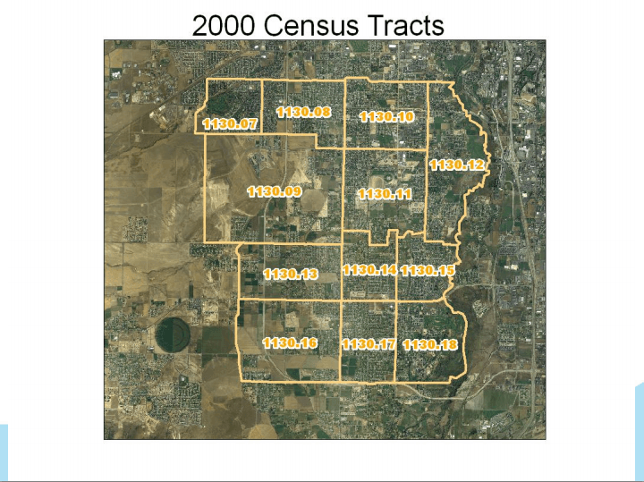
Over time, population change split the 1970 tract above into 12 tracts in 2000. Picture courtesy of Census document
This poses challenges when comparing data aggregated to census tracts over time.
The first step toward tackling such a problem is getting a better sense of what changed. Census provides relationship data between old and new tracts. It is detailed, but not digestible.
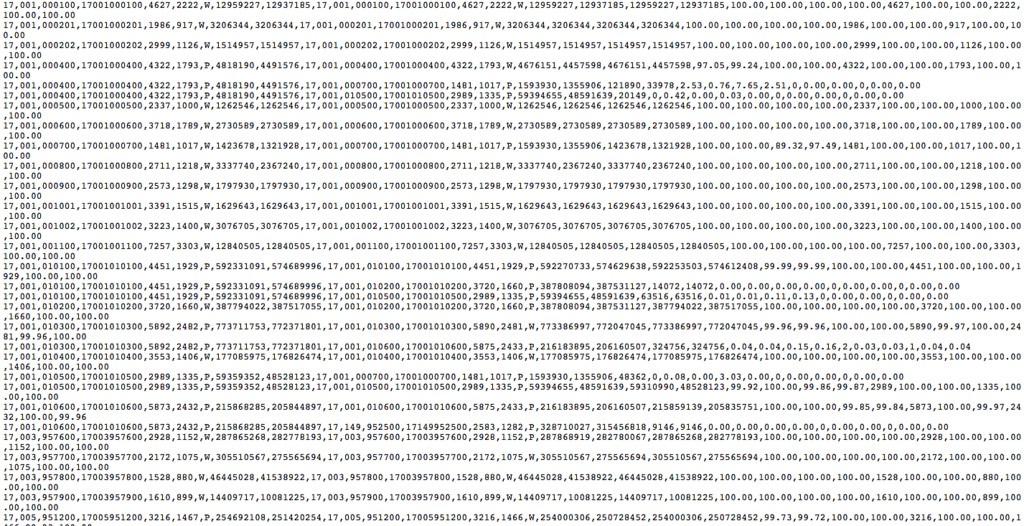
A snippet of census tract relationship data for Illinois
Here are snapshots showing how the site makes tract changes easier to understand, by type.
Merges
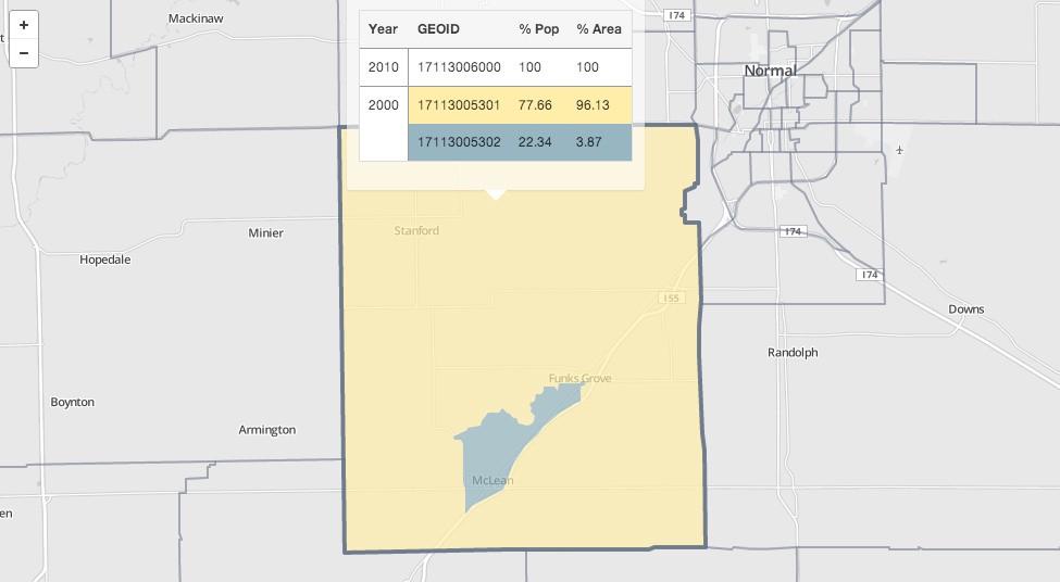
This 2010 tract 17113006000 is a merge of two 2000 tracts.
Splits and Revisions
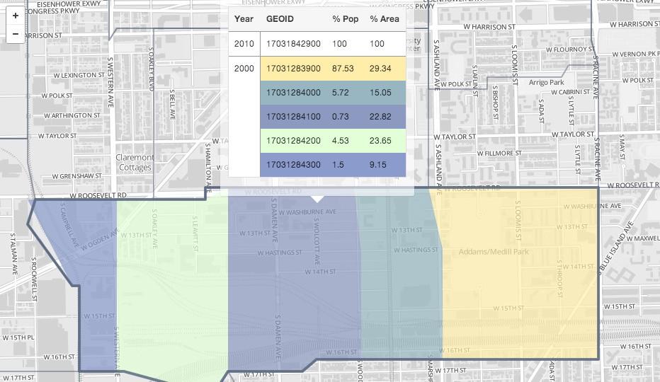
The colored polygons show all 2000 tracts that were split and/or revised to compose the Illinois 2010 tract 17031842900.
No Change
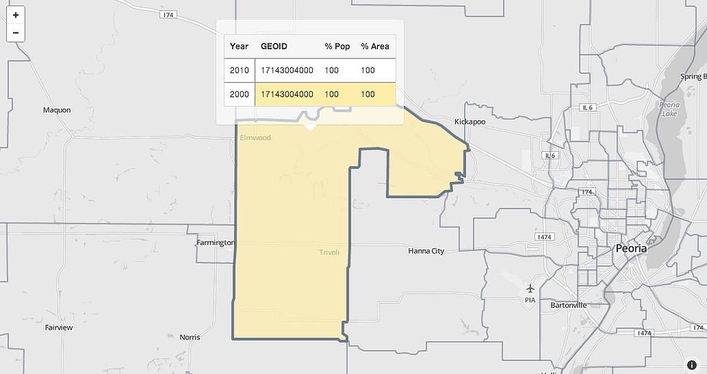
When the tooltip displays only one 2000 tract in yellow, like tract 17143004000, there was no change.
TopoJSON limitations
The tool shows all changes, but very fine changes may not show well. We simplified the TopoJSON to 20% precision of the original shapefiles. This increases browser speeds dramatically, but it limits the ability to clearly see fine changes. For example, tract 17111871500 is composed of parts of four 2000 tracts, two of which don’t appear to fall within the 2010 border due to simplification.
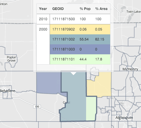
The purple 2000 tract contributes 0 percent population and area because Census calculates all percentages to 2 decimal places.
Fork your state
The code is available on GitHub, and can be replicated for other states by downloading Census relationship files and re-running the python script and script.js files. Tweet @developmentseed if you need any pointers!
What we're doing.
Latest