

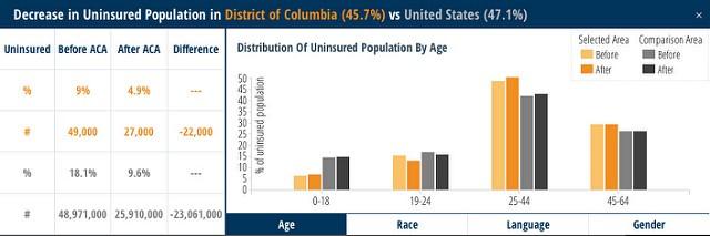
Yesterday the Kaiser Family Foundation released a new data browser that visualizes the potential impact of the Affordable Care Act on Medicaid and uninsured populations across the country. With the recent launch of the new healthcare.gov in preparation for the new Health Insurance Marketplace in October, this tool helps communities learn more about the upcoming changes.
Check out the site to explore the data and the potential change in your community.
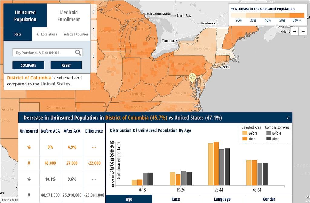
Full view of the tool showing potential changes in Washington, DC.
Behind the browser
Similarly to how we’ve built light data browsers in the past, we’ve built this site with ease of use and high performance in mind. All maps were designed in TileMill and integrated to the user interface with MapBox.js and MapBox hosting. We’ve made use of d3.js to power the chart comparisons at state and local levels and provide the additional contextual and comparisons needed to explore the data further.
To allow users to quickly search based on city, zip code, or address, we added search functionality with MapQuest’s Nominatim Search API. Nominatim is powered by OpenStreetMap data and leverages reverse geocoding. The data comes from the Urban Institute’s American Community Survey-based Health Insurance Policy Simulation Model.
Check out the map and explore the data for yourself.
What we're doing.
Latest