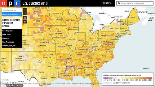
The Hispanic population in the United States has grown significantly in the past decade, with Latinos now making up every 1 in 6 residents. Much of the rapid growth — 118 counties have experienced a population change of more than 250%, four have experienced change of more than 1000% — is in the South and Midwest, areas that previously had low Hispanic populations. This morning NPR kicked off a series chronicling this population change and how its changing our overall makeup as a country and impacting towns across the United States. As part of its coverage, NPR is using an interactive map of Census data to show the story of population change.

Using data from the 2000 and 2010 Census, the map shows where the Hispanic population is increasing, which is the case for 2,962 out of the 3,142 U.S. counties. The percentage of population change is shown via a color scale, with the darker orange and red depicting areas with the fastest growth. This is shown alongside race and ethnicity data, with all data coming from the Censuses. Users can view data on the state, county, and census tract level — allowing them to drill down to see which towns are experiencing the most change. For example, you can see that Luzerne County, PA — home to the towns Scranton and Wilkes Barre — is seeing its Latino population grow at 478.8%, while its non-Hispanic population has declined by 5.11%. World Borders Dark + USA Census Hispanic AK & HI Tract-level + USA Census Hispanic Cont.USA… Edit descriptionapi.tiles.mapbox.com
You can also opt to view population change on a whole, where you can see that Nevada, Arizona, and Utah are growing the fastest with total population growth of more than 20%, but are just in the mid range as far as increases in their Hispanic populations. World Borders Dark + USA Census Total Population AK & HI Tract-level + USA Census Total Population… Edit descriptionapi.tiles.mapbox.com
Additionally, NPR’s map highlights five cities — Los Angeles, New York, Chicago, San Francisco, and Washington, DC — and zooms in from it’s interactive homepage to show the stories of these cities, all with traditionally large Hispanic populations. Drilling into the census tract level reveals interesting stories. For example in Washington, DC, you see that the historically Hispanic neighborhoods Columbia Heights, Mt. Pleasant, and Adams Morgan all saw large decreases in Hispanic population while nearby suburban towns saw huge increases. World Borders Dark + USA Census Hispanic AK & HI Tract-level + USA Census Hispanic Cont.USA… Edit descriptionapi.tiles.mapbox.com
Technology behind the map
This map was built using all open source tools and open data. We used Postgresql/PostGIS to handle the data, our map design studio TileMill to create the map, and the JavaScript libraries Wax and Easey to add interactivity to the map. The map itself is hosting on our MapBox hosting service.
All data comes from the 2000 and 2010 U.S. Census. It was downloaded from the Investigative Reporters and Editors Census data website and combined with Census Bureau shapefiles in a Postgresql/PostGIS database. Tilemill support for PostGIS allowed for a full integration of multiple levels of census data into one complete map. The roughly 1GB of data is then displayed on the map and is openly available in MBTiles format. The map — and any view of it — can be downloaded into any website just by clicking on the scissors icon and copying and pasting that code.
Throughout the week, NPR will be releasing stories on the changing Hispanic population. We highly recommend you read and listen to today’s stories, How Latinos Are Reshaping Communities, A Look At Iowa’s First Majority Hispanic Town, and Young Hispanics To Keep Shaping U.S. Landscape, and follow the series. You can explore the interactive map on the NPR website.
What we're doing.
Latest
