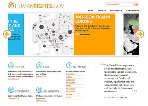
This morning the U.S. Department of State’s HumanRights.gov program released new visualizations of data contained within its human rights reports, one of the most important document tracking abuses reported around the world. The sad reality is that this is a long report, and released as a PDF document it’s time consuming to read and make sense of. By releasing this data on maps, HumanRights.gov is able to hone in on specific human rights issues — like Anti-semitism in Europe, Internet Freedoms in the Middle East and North Africa and Criminalization of Sexual Orientation and Gender Identity in South Asia — and better call out, leverage, and communicate about this data.

The HumanRights.gov team will present these maps, their strategy around them, and their plans to visualize more data in online maps this afternoon at the Tech@State data visualization conference, in the State Department and USAID Data Visualization Projects panel at 1:00 pm. If you’re attending Tech@State, be sure to stop into the session and read on for more details on how they took data previously released as text in a PDF and mapped it, and why.
Mapping paragraphs
A large portion of the information presented in these maps was originally communicated in paragraph form, meaning that specific data to map had to be identified and additional textual information presented elsewhere on the map. The Anti-semitism in Europe map does this in two ways. The first map view is of Europe as a whole, showing circles scaled to the aggregate instances of anti-semitism reported in each country. Users can click on these circles, bringing up a country overview with text describing the general status of anti-semitism within the country.
The user can then drill down, revealing randomly placed dots that contain textual information on specific incidents that occurred within the country. This exposes a large amount of textual data — 49 countries in Europe with about 170 incidents comes to 220 paragraphs of text. In this way, the map quickly communicates where anti-semitism is a problem across Europe, and then lets users drill down to get more information and ultimately a description of each incident.
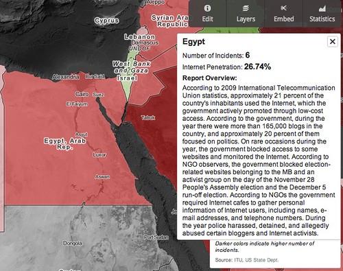
The maps on Internet Freedom and Criminalization of Sexual Orientation and Gender Identity both show data at the federal level, therefore making more sense to present the data as choropleths. Users can access similar country-level textual data in these maps by scrolling over a country to pull up an interactive text box.

A look at the country overview of Egypt showing government monitoring of the internet
What’s next for humanrights.gov
Human rights reports are filed annually for every member country of the United Nations. Currently, this data is locked away in lengthy PDFs. These three maps prove conceptually how this data can be communicated and shared quickly via online maps. As more information from these reports is released though online data visualizations, this information will be able to be shared, combined, and analyzed in a dramatically faster way.
Built with open source
These maps were created using the map design studio TileMill. They are hosted via TileStream, and are publicly available to use in HumanRights.gov’s TileStream account.
Look for more maps being posted at HumanRights.gov soon, and if you’re at Tech@State today stop in to their panel or look for Scott Jones to talk more about this initiative.
What we're doing.
Latest