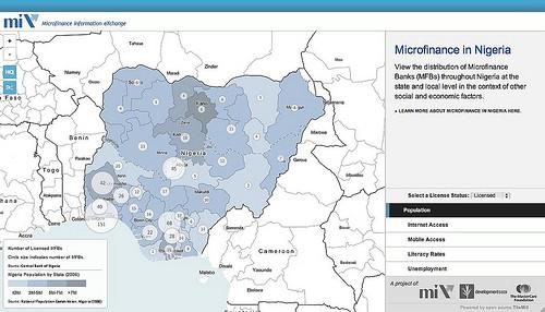
To better visualize the subnational microfinance landscape in Nigeria, we partnered with the Microfinance Information Exchange (MIX) to build Nigeria.MIXmarket.org. The new site is a window into a part of the world experiencing a microfinance boom with growth rates ranging between 20 to 50 percent over the past few years. The site shows where banks are and aren’t operating and aims to help show why by relating the locations of microfinance banks with potentially relevant socio-economic indicators.

Scott Gaul has a great post describing the microfinance landscape in Nigeria:
In 2006, the Central Bank of Nigeria began to transform a network of several hundred community banks into ‘microfinance banks’ (MFB). Since that time, the registration rolls have ballooned, now to over 900 institutions, albeit not without considerable turmoil. 224 banks had their licenses revoked in 2010, only to have 121 of these reverted back to a state of provisional approval months later. Reporting from clients indicates that many are uncertain or suspicious of these banks, and the sheer numbers create a regulatory burden. At the same time, more than 60 percent of the population of Nigeria are financially excluded or have informal access only — 71 percent of loans are from family or friends, for instance. So, when there are several hundred financial institutions across the country focusing on low-income clients and able to offer a range of services, it’s worth trying to lean more about the details and dynamics of that sector.
Through the use of interactive maps, the site aims to tell the story of the microfinance landscape in Nigeria and raise questions by making it easy to compare other data sets to bank data. Users can navigate the maps and visualize the data in a number of ways. When first loaded, a map visualizes the total number of microfinance banks licensed by the Central Bank of Nigeria as density points geocoded at the state level, letting you quickly see a national view of banking operations. As you zoom in, the detail of the bank data increases to local government areas where that data is available. The bank data can be toggled between “licensed” and “provisional” status, which changes the density points.
To give context to this data it is laid upon choropleth layers of socio-economic indicators from the National Population Commission, the first of which maps population per state. This immediately brings up some questions, like why the most populous state of Kano only has six microfinance banks when Lagos, the second-most populous, has over 150. Additional contextual data shows a trend of lower bank numbers per population in Muslim states north of the the Sharia line.
Kano, the largest State in Nigeria, has only six microfinance banks
An important question is whether people in need have access to microfinance banks. When you look at unemployment data versus the number of banks per state, you see that the most depressed states also have some of the lowest numbers of banks.
View of unemployment per state versus access to microfinance banks
By mapping access to mobile phones, you can quickly see the potential for microfinance banks to expand into certain areas of Nigeria, which is key as mobile banking is on the rise in much of Africa. Much can be gleaned from the internet access and literacy rate maps as well.
View of mobile phone access versus banking access in Nigeria
In addition to the map functionality on the site, there are a couple key features designed to make data as accessible as possible for the end user. First, the site automatically detects bandwidth speed and switches between low and high compression of image tiles to allow for better performance in low bandwidth environments. The maps used in this site are all powered by TileStream Hosting by MapBox, which has a built in low bandwidth API to detect this. For more technical details on how this works read Dave’s blog post on ‘Five Ways to Make Fast Maps for Low Bandwidth Environments’.
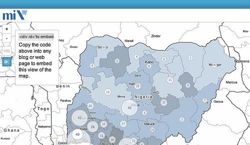
Second is the ability to embed any map viewed on the site, complete with whatever layers you are looking at, into any other website, just like you would a YouTube video. All it takes to embed a map is to copy one line of code using the scissors icon and embed the current view of the map anywhere on the web. A large goal of the site is to let people share and tell their own stories around the data, and this embed features makes it easy to do so.

Built with open source
All maps on the site were built using TileMill, our open source map design studio. They, and the layers that are contained in them, are publicly available at tiles.mapbox.com/mix on our map hosting service TileStream. The site itself is very lightweight and uses only minimal html, css, and javascript. We used Wax, a collection of tools that make it easier to publish maps on the web, to integrate them into the site.
This site will be continuously update by MIX, and we hope it will play a role in communicating about the rapid growth in Nigeira’s microfinance sector. For more information about microfinance side of the project, read MIX’s blog post on the project, and explore the maps and data yourself at Nigeria.MIXmarket.org.
What we're doing.
Latest