
Releasing Public Maps of the Famine Crisis and Relief Efforts in the Horn of Africa
- Estimated
- 3 min read

Over 13 million people in the Horn of Africa are facing a hunger crisis. Drought, conflict, and rising food prices have led to a famine that will last for months. More than 45 humanitarian and relief organizations are working to mitigate the disaster, though, an estimated 170,000 children are severely malnourished and at risk of starvation. Under these circumstances, operational efficiency is critical. To help we’re organizing a public directory of maps that explain and measure the impact of the crisis and the relief efforts meant to reduce its impact.
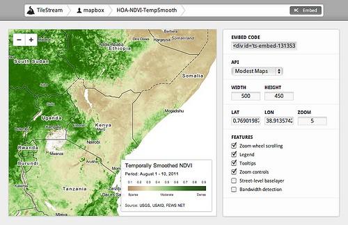
These maps are freely available to use from MapBox’s TileStream map gallery, and we encourage you to use them in your websites, operational work, or in any way you see fit. You can embed these maps on any website or blog by clicking on a map, selecting ‘embed’, and setting the dimensions of the map. Then just copy and paste the code to your web page or blog post, just like a YouTube embed.
Moreover, you can add your own data to these maps by creating additional layers using TileMill, our free open source map design application. We’ve included a few layered maps in the map gallery to show how this works.
By starting a public map gallery that focuses on reusable, shareable map layers, we want to help everyone who is working in this space to be as efficient and as informed as possible. We will continue to release new maps related to the famine as data becomes available. To request that we process a certain dataset, let us know.
Finally, we’re interested in helping organizations become better at using data to drive decision-making and resource allocation in crisis situations. Based on previous relief work regarding the earthquakes in Japan and Haiti, and the floods in Pakistan, we know the value of good strategy and partnerships. To stay involved in our crisis response efforts, sign up here.
Now let’s look more closely at the specific maps we’re releasing today. We’ve reprocessed operational data made available online into five layers related to the drought impact and the situation on the ground in the region.
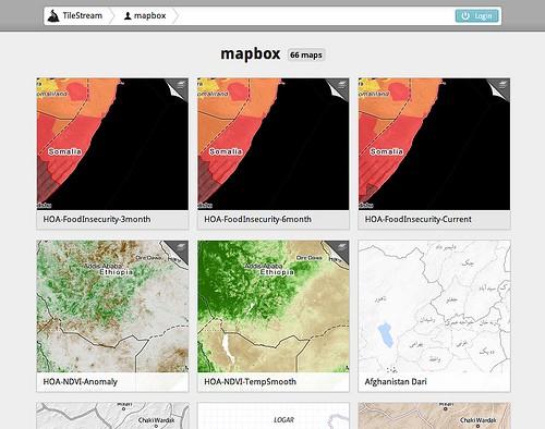
Food Insecurity Layers
We’re releasing three layers of estimated food insecurity across the region. The data is made available from the Famine Early Warning System Network. The food insecurity classification shows the wide-reaching affects of the drought and the areas of most need. The current status map shows exactly where famine has been declared. We can also see that while southern Somalia is the worst affected, the whole region is under significant stress. Dark red indicates declared famine areas, where food access is low, and both malnutrition and death are at emergency levels.
In the two food insecurity outlook layers, we see the estimated spread of the declared famine areas. We can see that the situation in southern Somalia is expected to worsen given the complexity of the violence and conflict that has restricted humanitarian aid.
Two layers of Normalized Difference Vegetation Index (NDVI)
We’ve reprocessed two indicators of drought, the current measure of vegetation or NDVI, and the NVDI Anomaly, a measurement showing the difference from the mean over previous years. These two maps give a unique look into drought conditions across the region.
Taking Action
Donate to help relieve hunger through the World Food Programme. Get started using these maps by embedding them from TileStream, or sign up to stay engaged with our crisis response efforts.
What we're doing.
Latest