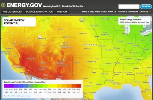
This morning, the United States Department of Energy pulled back the curtain on a complete overhaul of Energy.gov.

The New Media team at DOE is leveraging MapBox maps to lead the way for more consumable open data:
The new platform utilizes the latest technologies in information visualization, bringing updated and interactive charts and maps to Energy.gov and making energy information more relevant to individuals. The Department is also now able to offer more open data sets for individuals to use and apply to other online applications.
Check out the site’s Maps & Data section, prominently featured in the main navigation menu.
In all, Energy.gov features 10 MapBox maps in various contexts.
-
The main feature on the homepage is a map of thousands of alternative vehicle fueling stations. Visitors see a beautiful full screen interactive map that lets them drill down on the specific type of fuel, location and hours for each station in the country. Power users can download the map’s data as a shapefile and integrate it into other applications.
-
Explore the energy economy through three more interactive maps showing state-by-state energy production, consumption, and expenditure, as well as a map of DOE Recovery Act projects across the country. Again, all the source data is available for download.
-
The Maps & Data browser is an open data clearinghouse currently featuring 10 datasets, each with a custom, interactive map and data download.
We couldn’t be more excited to see the US government embracing data visualization as an integral part of an open data strategy. We think open data should be immediately actionable and easily consumable. These maps expose valuable public information like alternative fuel stations and energy consumption and production in an immersive and compelling interface that lets users zoom and pan to areas of their interest and click to reveal detailing information, ultimately leading to an engaging way for for visitors to get instant value from open data.
And if that wasn’t enough, DOE is fully embracing the value of two other things near and dear to us: open source and cloud technologies. In fact the DOE estimates this new website will save taxpayers more than $10 million annually. The new Energy.gov is built on the open source Drupal content management system and hosted on a cloud infrastructure. The maps were made by Matthew Loveless at the DOE using open source TileMill and hosted on the MapBox TileStream cloud hosting service. DOE states that, “These back-end changes provide scalable and flexible architecture that supports innovative, efficient online engagement while saving money and lowering the costs of future improvements.”
Overall the “Energy.gov reform initiative is part of the Obama Administration’s Campaign to Cut Waste, a dedicated effort across the federal government to streamline operations, end unnecessary spending and save taxpayers money,” and we couldn’t be more proud to be a part of it.
What we're doing.
Latest