This morning the National Democratic Institute opened up their Afghanistan election data browser to the public. This is a massive liberalization of election data that previously had been baked into PDFs. The tool allows users to browse the raw vote count from the recent election on a national view and quickly drill down to a provincial, district, and even polling center view — showing the number of votes all the way down to the ballot box. Users can run custom queries to see the number of votes per voting station and the percentage for a single candidate, and see the results on custom maps of Afghanistan that have additional data overlays like ethnic and security data. All of these voting trends are then graphed down to the polling center level.
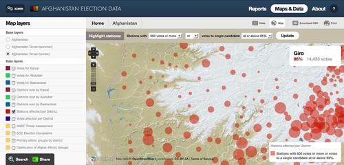
Here is a look at front page of the data browser. The map shows polling stations that received 600 or more votes, which is a critical number because it represents that 100% of possible ballots were cast. In an election with very low overall participation, this number shows a clear outlier.
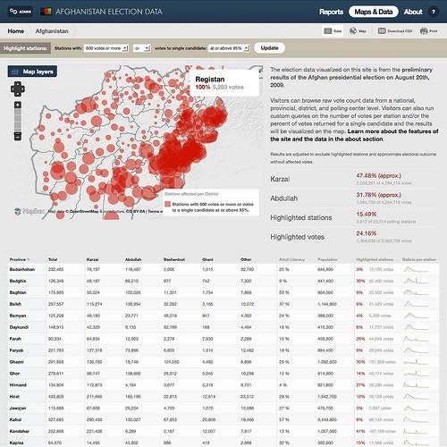
This data browser was used internally throughout the fall by NDI’s team and its partners on the ground in Kabul and Washington, DC to visualize voting irregularities from Afghanistan’s presidential election in August. While the election is long over, the site now takes on new public value as preparation begins in Afghanistan for next year’s provincial council (Wolesi Jirga) elections.
Below is a walk through of the site’s key functionality. The data browser was built completely with open source tools, including Managing News, a pluggable data aggregator built on top of Drupal, and all the maps were generated by MapBox, our open source mapping stack. The site was also built entirely with open data and is a real life example of what can be done under the U.S. ‘Open Government Directive.’
PDFs are handicapping data that should be free
All of the data visualized on this site is from public data sets. The real meat comes from the Independent Election Commission’s two main data sets — the original Master Polling Center list of 6,969 polling centers and the IEC’s preliminary election results from September 16th, a 2,500 page PDF that gave Karzai over a 54% win. This latter document is key, since it made Karzai the clear winner with no runoff required since he had received more than 50% of the votes. However Karzai’s majority win was later overturned once the extent of fraud was revealed and his total votes dropped below 50%.
Here is a look at the data released by the IEC on September 16th as a 2,500 page PDF.
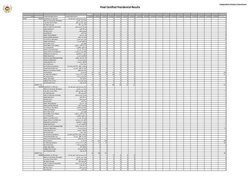
Data was parsed from these PDFs using a set of scripts that Tom wrote, and processed into the site using the Feeds and Data modules, which both ship with Managing News. Once the data was in the site, we were able to develop a very custom workflow and powerful visualizations.
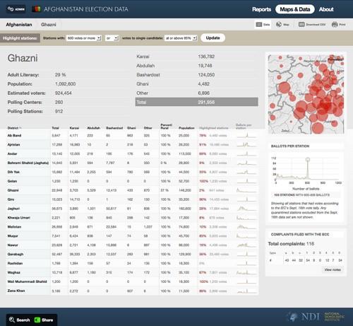
We can a see the vote breakdown at the province level, which you can see below for the Ghazni province.
Here we can drill down into a district — in this example Giro — to see the breakdown of votes and graphs of voter participation per station, with the spikes of 600 showing that something odd is happening compared to the rest of the votes.
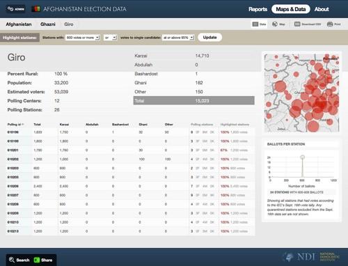
The “Highlighted Station” bar, which lets you run specific queries, stays with you throughout the entire site.
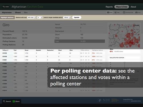
This is key because when you run a query you see the affected stations within the district that meet your criteria.
Contextualizing the data
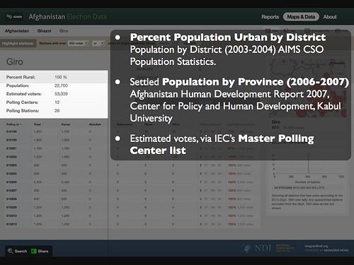
In addition to the IEC’s data, we pulled in third party data from the United Nations and other development agencies to add more content to each place we were looking at on the site.
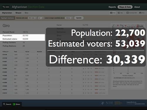
Here we see the district’s population numbers and the proportion of urban inhabitants to rural ones.
One particularly critical example of how context like this matters is with the security situation. Election day — August 20th — was the most violent day in Afghanistan since the Taliban was ousted. We made several security tile overlays showing threat levels and incidence on the district and province level so that users can have that context when seeing the data queries.
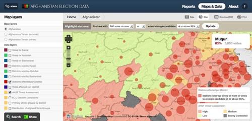
Here you can see the Afghanistan National Security Force threat assessment from August 13th as a tile overlay. We are looking at the Ghazni province and the votes and stations affected with 600 votes — 95%.
The maps
In a country like Afghanistan that is underdeveloped with many settlements in very remote and isolated areas, logistics matter. Donkeys were even brought in to transport ballot boxes in the election. In addition to a light grey map of the country, which was used to provide a clean pallet to then overlay data on, we made two additional base layers — a hillshade map using SRTM, AIMS, and OpenStreetMap data, and a winter map showing the winter snow line at 1,800 meters.
Here you see the central part of the country — high in the Hindu Kush — covered in snow, which would have made participation in a late season election runoff impossible.
AJ, who designed these maps, has two incredible blog posts with more details:
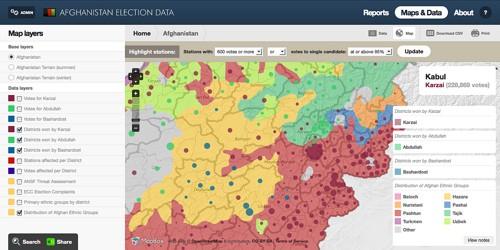
We also designed custom ethnic maps, needed to help show the demographic makeup of a very diverse country that has longstanding ethnic and tribal tensions and how this impacted the elections. Here we use data from the GREG (Geo-Referencing of Ethnic Groups) project with an overlay of data from the site showing winning candidate by district.
Open data and open source
Working with open source tools gave us the flexibility to build a highly custom solution for NDI and building on top of Managing News let us build it faster. In some ways this application serves as a living monitoring and evaluation report that shows the results of what a $300 million foreign donor funded election looks like. The “living” part is what is key here, since this M&E report is really about helping future projects in real time.
It is exciting to see how fast talk about open data can turn into real systems at USAID. This tool from NDI is one of the first large open data wins at USAID, but based on the chatter here in Washington, DC, it is just the beginning of a new trend.
What we're doing.
Latest