


The Global Food Twin turns a complex model of how food is produced, transported, and consumed into an interactive view of one of the world's most interconnected systems.

Where does your breakfast come from? The banana on your table may have come from Ecuador, while the wheat in your bread could trace its origins to fields in Ukraine or Kansas. Behind both is a vast network that grows, moves, processes, and delivers food to billions of people.
Globally, we produce enough food to provide nearly 3,000 Calories per person, per day, yet hundreds of millions of people still go hungry. And because food moves through an interconnected global system, disruptions in one place can affect availability and prices thousands of kilometers away.
What if we could see how food actually moves around the world? Could that visibility help us understand where food comes from, how regions depend on one another, and where the global system may be vulnerable to disruption?
Making a global model explorable
The Global Food Twin is an interactive visualization that traces the production, transportation, and consumption of the vast majority of calories produced worldwide.
Earth Genome partnered with us to turn a global food-system model developed by the Better Planet Lab and collaborators into an experience people can explore in a web browser.
For our team, the challenge was translating thousands of regions, transportation routes, food categories, nutritional outcomes, and socioeconomic indicators into something people could navigate without losing the complexity of the underlying model.
What if we could see how food actually moves around the world?
Food Production
The story begins with where food is grown, raised, or caught. That is also the first view in the Global Food Twin.
Ten categories of food are displayed at 10 km resolution, colored by the "uniqueness" of production in each area. The score highlights which food type dominates production in a region compared with its neighbors, making patterns such as the rice-producing regions of Southeast Asia or wheat-growing areas of the American Midwest visible at a glance.
Hover over the map to identify the sub-national region behind those patterns. Select a region or search for one to go deeper, with detailed breakdowns of what it produces, where its food goes, and key socioeconomic information.
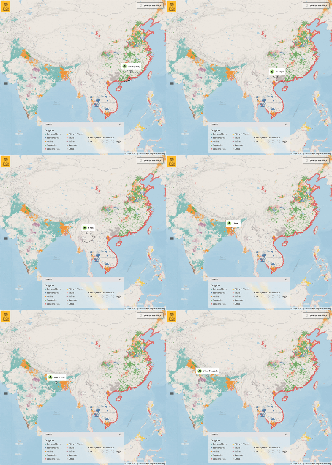
The production view displays ten food categories at 10 km resolution. Hovering reveals the region's name.
The sidebar brings those different dimensions together, including total food exports, agriculture's contribution to GDP, population, and human development indicators. A production breakdown shows the balance of grains, oils, meat, pulses, and other food categories, providing a more complete picture of each region's role in the global food system.
Understanding Regional Production
Select any region to dive deeper into its food story. The sidebar reveals data about the region, such as the total food exported, agriculture's contribution to GDP, population, and human development indicators. A breakdown shows exactly what food categories the region produces, from grains and oils to meat and pulses, so you can see each area's role in the global food system.
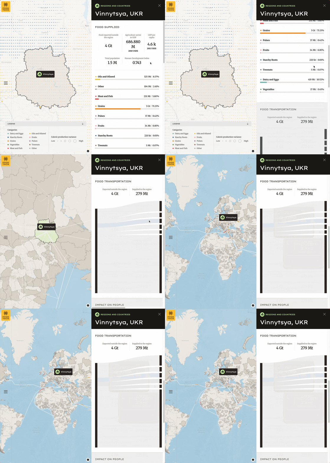
Regional detail for Vinnytsya, Ukraine shows that grain production dominates this region at 71%, alongside key socioeconomic indicators.
Food Transportation
Scroll down to see where food goes and how it gets there. As the map zooms out to the global transportation network, animated particles trace the journey of calories along shipping routes, railways, and roads. Particle density corresponds to volume: more particles mean more calories moving along that path.
Because the data is enormous, only the top several hundred transportation flows are visualized. These flows still represent the majority of global food movement. The sidebar displays the top destinations by weight in a Sankey diagram, which is a flow chart that makes it easy to see where a region's food production ends up.
Following Food Around the World
Understanding where food is produced is only part of the picture. The next challenge was showing where it goes.
As you move through the Global Food Twin, the map zooms out to reveal a global transportation network. Animated particles trace calories moving along shipping routes, railways, and roads. Particle density corresponds to volume, so routes carrying more food appear busier.
Visualizing every connection at once would make the network difficult to interpret and put unnecessary demands on the browser. Instead, the application displays the top several hundred transportation flows, which still represent the majority of global food movement.
For a selected region, a Sankey diagram in the sidebar provides another view of those flows, showing the leading destinations by weight. Together, the map and diagram make it possible to move between the geographic shape of the network and a more direct comparison of where a region's food ends up.
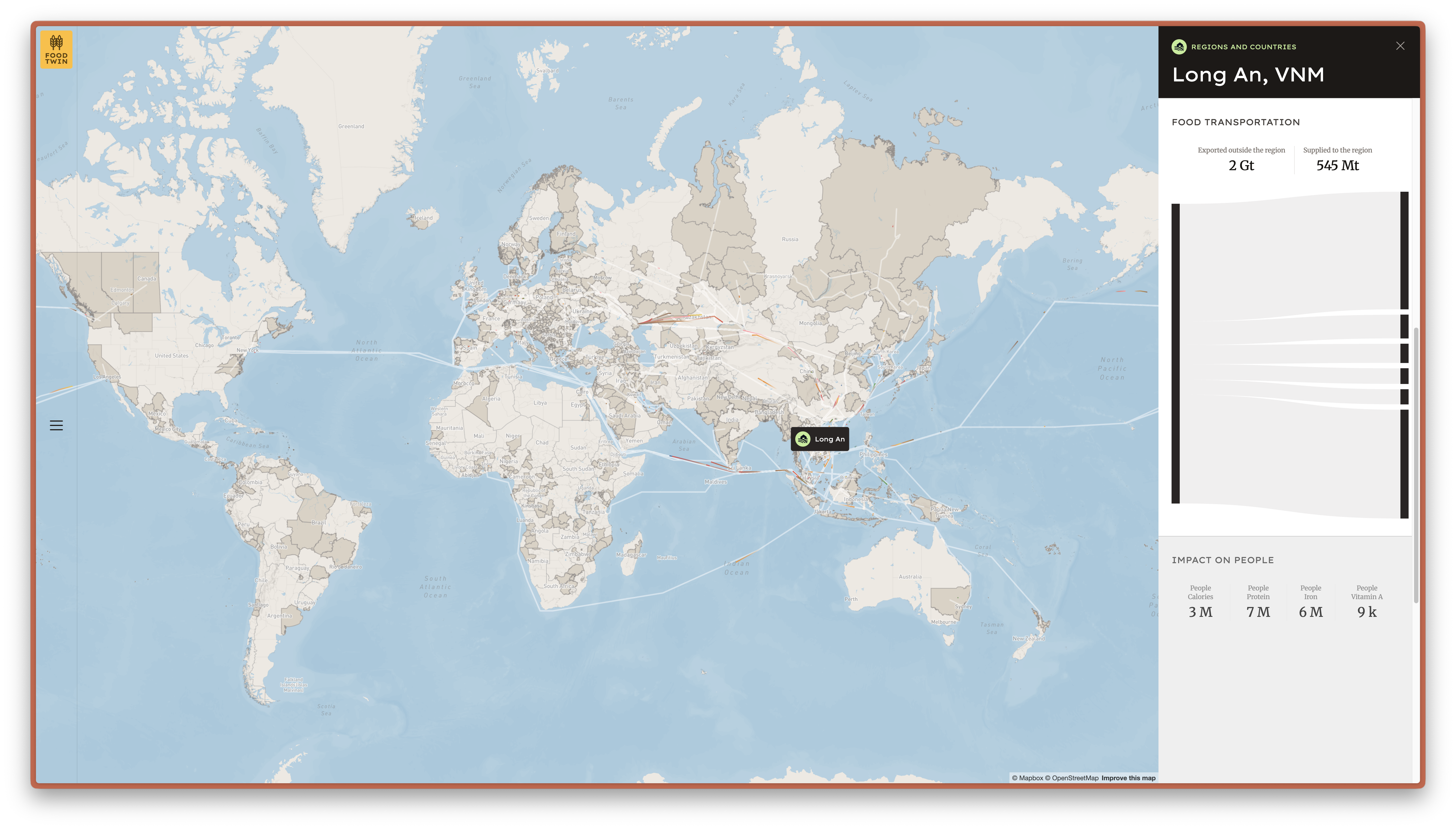
Transportation flows from Long An, Vietnam show the global reach of regional food production, with metrics on how many people's nutritional needs are met.
Connecting Food to People
The final view connects food production with the people it could support.
For each region, the sidebar estimates how many people's yearly calorie, protein, iron, and vitamin A needs are met by the food produced there. Population density is added to the map, providing another way to understand the relationship between where food is produced and where people live.
Putting these layers together turns global totals into something more tangible: the contribution of individual regions to food and nutritional needs within a much larger system.
Making Global Food Flows Work in the Browser
Behind the visualization is a large model output connecting food production across thousands of regions with the routes and destinations through which it moves.
Our job was to make that complexity usable on the web.
The application is built with Next.js and PostgreSQL, with React Map GL and Deck.gl powering the mapping and visualization layers. React Map GL provides the interactive base map, while Deck.gl handles the high-performance data layers.
For the transportation network, we use Deck.gl's TripsLayer, which is designed to animate movement along paths. Here, it carries particles along transportation routes, giving users an immediate sense of both movement and relative scale.
The technical challenge wasn't simply drawing thousands of connections. The model output is large enough that trying to load and visualize everything at once would quickly overwhelm both the interface and the browser. We had to make decisions about what data to serve, how much to render, and how to represent it without obscuring the larger patterns.
The result is an interface where users can move from a global view down to individual regions and routes without having to think about the size or complexity of the dataset underneath.
From Exploration to Decision Support
Today, the Global Food Twin is primarily an exploration tool. It provides a way to see relationships that are difficult to understand from tables, model outputs, or individual datasets alone.
But the same interface and technical foundation could support more decision-oriented applications as the underlying models evolve. Future disruption modeling, for example, could make it possible to explore questions such as:
- What happens to food flows if a major shipping route is temporarily unavailable?
- How might extreme drought affecting a major crop-producing region change the wider network?
- If a region faces a particular nutritional deficiency, where might alternative food sources come from?
Answering questions like these requires more than visualization. It depends on the models and scientific work behind the data. But making those models explorable is an important step toward putting them into the hands of people who can use them.
The Global Food Twin gives us a new way to see a system we all depend on: not simply where food is produced, but how places are connected through the food that moves between them.
Working with complex models or datasets that need to become usable tools? Get in touch to talk with us about your project.
Related content
More for you
What we're doing.
Latest