

After three years building storytelling tools with NASA, we’ve learned that the hardest part of open science isn’t the data it’s how we tell the story.

We work with a lot of scientists, which means we read a lot of scientific papers. And we spend a lot of time squinting at screenshots of maps. Months of analysis flattened into a screenshot.
In the 1800s you might have learned about the smallpox vaccine through a newspaper.
Now it's 2025. We stream live video across continents and use AI to write code. But when it comes to sharing science, we've basically put the newspaper online.
We have a screenshot problem. The good news is: it doesn’t have to be that way.
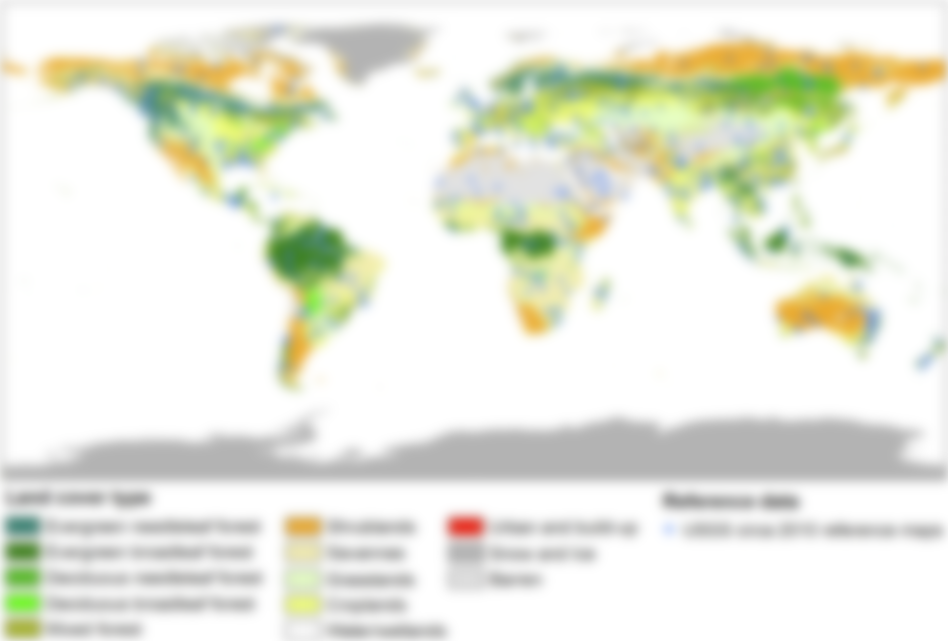
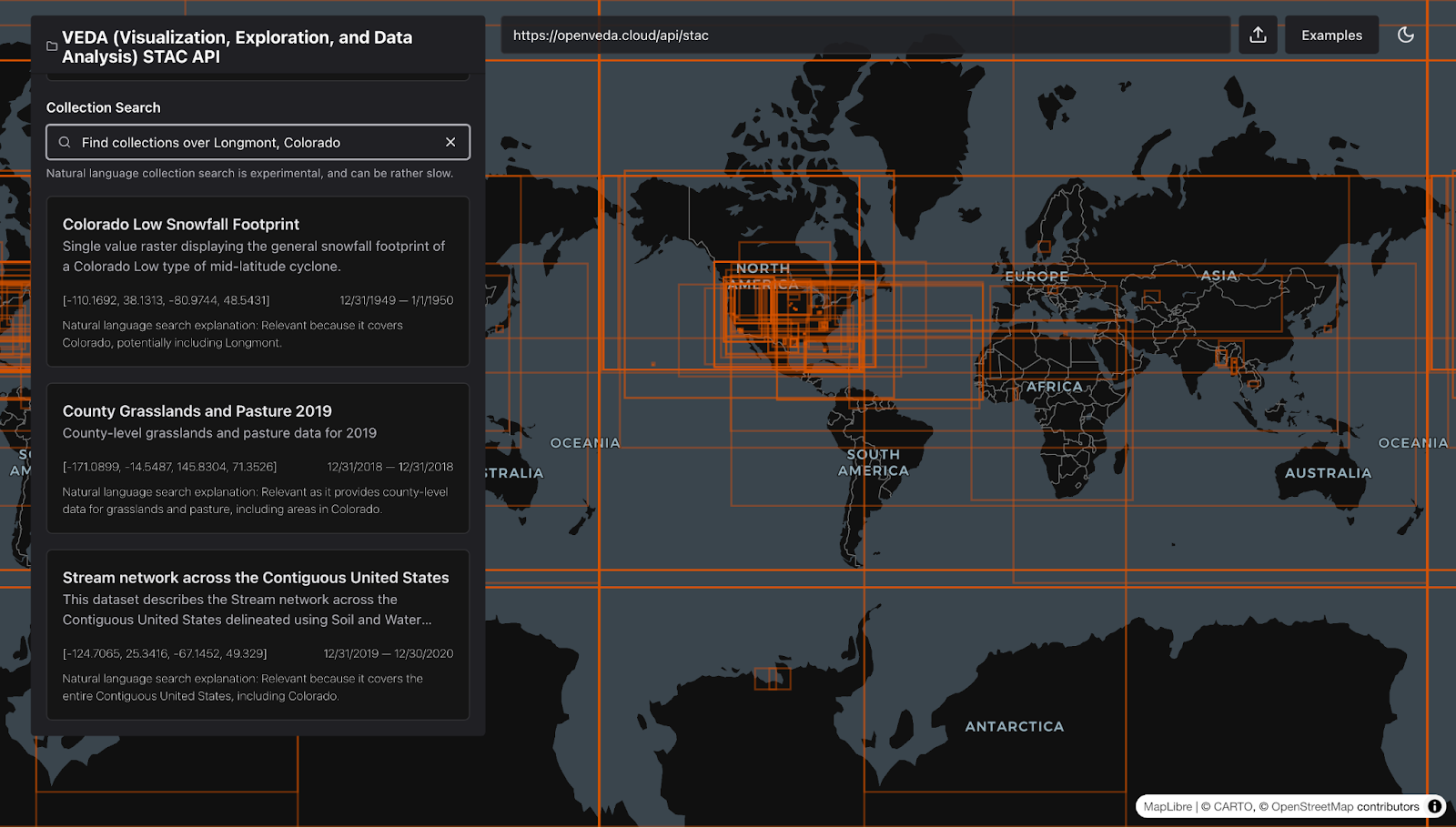
We blurred the map because we're not calling anybody out, but you get the point.
The tools to tell interactive, data-driven stories already exist. They’re just too expensive, too complex, or too disconnected from the open workflows science depends on.
We've shared the Fire Event Explorer before. It lets users create animated GIFs and videos that show change over time. It's great progress but let's be honest, that's like printing the front page of the newspaper in color.
On the web, the default should be engagement.
We need to move from static images and GIFs toward truly interactive experiences, like we did with the Fire Event Explorer below.
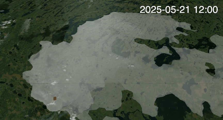
GIF generated using the Fire Event Explorer
A More Engaging Future for Science Communication
Tools like ArcGIS StoryMaps proved there’s a real hunger for storytelling platforms that make data approachable. We can build on that success by creating open-source tools that are grounded in the principles of science itself: openness, reproducibility, and collaboration.
If you already build engaging tools for communicating data, we see you. The community's best storytelling tools share three key traits:
- They build understanding through engagement.
- They show data directly from the source.
- They keep ownership with the scientists and storytellers.
Engagement Builds Understanding
When people can interact with and explore data, they discover insights. With cloud computing, we can rethink what it means to engage with geospatial data. From playing minesweeper to understand Airbnb distribution in Mallorca to chatting with historical figures on maps, the community is showing that static maps belong in textbooks, not on the web.
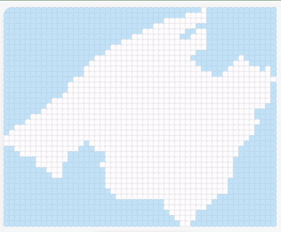
Credit: PlayableDataLab
Show the Science at Its Source
No screenshots. No duplicated datasets. No broken links to outdated information. The best storytelling tools live as close to the data as possible.
We’re building on top of eoAPI, a proven suite of services for processing geospatial data. With titiler-cmr, NASA can take advantage of modern visualization tools without rebuilding their infrastructure. Tools like NASA FIRMS use these same services to stay current and maintain scientific integrity.
It's not flashy work, but it delivers huge cost savings and performance gains while keeping open science actually open. But how we connect to data isn’t just a technical decision, it’s a statement about who controls the story.
Keep the Story with the Scientist
We know we're preaching to the choir, but it's worth repeating: ownership matters.
Organizations like EOx are building open source capabilities for dashboards and stories that are frontend-agnostic, so you're not even locked into a coding language. That's real openness.
The open-source community needs to lower barriers and reduce dependencies so scientists can use our tools without needing a masters degree in computer science. That way, their data and stories remain accessible over time, even when budgets shift or licenses expire.
The end goal for all of these tools is to keep ownership of our most important information in the hands of the people who created it.
Cloning this website can give teams a headstart in writing engaging stories.
What We've Learned
Over the last 3 years we have been experimenting on our own and collaborating with teams operating within NASA's Office of Data Science and Informatics (ODSI) at the agency's Marshall Space Flight Center (MSFC). We often work with groups within ODSI's Data Systems Evolution focus area that aim to communicate science more effectively to the public through the VEDA project. The software that we have built has been reused across NASA, powering the VEDA Dashboard, the Greenhouse Gas Center Portal, and earth.gov.
We’ve seen this impact firsthand:
- Exploring Texas Hill Country floods creates engagement unmatched by static articles.
- Interacting with Los Angeles fire maps builds trust amid misinformation.
- Making greenhouse gas data explorable helps policy makers act faster.
Some lessons were hard-won, and adoption challenges remain for organizations with limited funding or technical capacity. From this experience, we see as three big levers for bringing open-source storytelling to open science. Looking back across those projects, three design principles consistently made the difference between a prototype and a platform.
1. Make Integration Obvious
We often describe our new products in ways that attract new users, but rarely in ways that invite integration. Your tool should already be intuitive to use, so focus your energy on showing how it fits into users' ecosystems. Otherwise, it's just another prototype that people see once on LinkedIn.
Interoperability takes work. EOxElements leads by example here with clear documentation and reusability. We followed a similar approach with stac-map inviting collaboration with contributors of STAC Browser. The Fire Event Explorer embedded here works the same way because it's published as an npm package.
2. Design for Every Scientist
We pride ourselves on being user-centric in design, yet that standard often drops when it comes to the implementation. Point-and-click website builders were mainstream a decade ago. Tools like Replit have made even that easier. While you might not be competing with these platforms, they've shaped users' expectations.
This remains one of our biggest barriers to adoption on VEDA. We worked with NASA to build a website template that organizations can clone to create self-hosted data catalogs and interactive stories. It helps-but gaps remain. How do you manage content without a developer? Where is your data hosted and how do you provide access to it?
Without a clear open-source playbook, even great tools struggle to move beyond prototypes stage without significant funding. Accessibility matters, sure, but reliability decides adoption.
3. Build for Confidence Not Complexity
The open-source geospatial community is uniquely patient. We accept bugs because we understand what it takes to build software and we trust it will improve. Our broader user base is different. When software breaks, people move on.
If we want open-source storytelling to reach more scientists, we need to build less, and make sure it just works. Reliabilty builds trust. When open-source tools are dependable, people choose them not just on principle, but because they work beautifully.

It wouldn't be a tech blog if we didn't reference Steve Jobs.
Let's Build the Next Chapter of Open Science
Talk to a scientist for an hour and you'll quickly realize that they'll go to the ends of the Earth to see their research make a difference. Talk to them for a whole day, and you'll want to help them get there.
This moment calls on us to help scientists tell better stories and amplify the impact of their work, before it's forgotten. We're not there yet, but we're getting closer. If you're building tools that make geospatial data more accessible, let's collaborate.
If you're a scientist tired of squinting at static maps, reach out to us .
We're excited to get to work.
What we're doing.
Latest