Fly Me to the Poles - Going Global with NASA Airborne Data
- Estimated
- 6 min read
Exploring the Best 3D Mapping Libraries for Data That Crosses the Polar Circles.
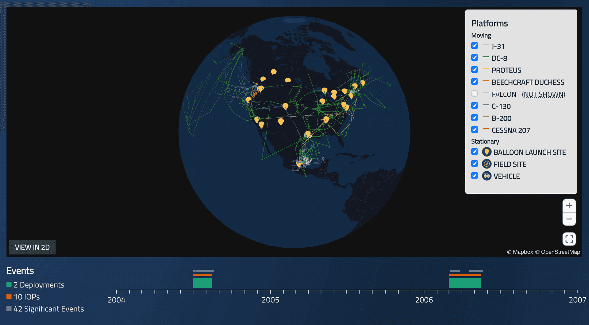
In an era where our smartphones effortlessly navigate us through city streets, it's easy to take modern web mapping capabilities for granted. Yet, when visualizing NASA's airborne data collection campaigns, we encounter a fundamental challenge: representing our spherical Earth on flat screens. This limitation becomes particularly acute when dealing with flight paths near Earth's poles, where traditional web mapping technologies struggle to maintain accuracy. Our journey to solve this visualization challenge led us through various approaches, ultimately arriving at a solution using three-dimensional data visualization.
In a previous blog post, we shared how we have been helping NASA’s Airborne Data Management Group (ADMG) process and publish the flight tracks of the airborne data collection campaigns on the public-facing platform CASEI, the Catalog of Archived Suborbital Earth Science Investigations. While processing some of these campaigns, we came across a limitation of the default Web Mercator projection: as airplanes fly over or very close to Earth's poles, their flight paths cannot be correctly visualized on the default Web Mercator projection.
Embracing the Third Dimension
Our quest for accurate polar visualization led us to test the limits of features for three of the top web mapping libraries: Mapbox's established Globe View, MapLibre's experimental features, and Deck.GL's 3D rendering capabilities. Each offered unique perspectives on the challenge of representing polar flight paths, ultimately guiding us to a solution that balances visual accuracy with technical performance.
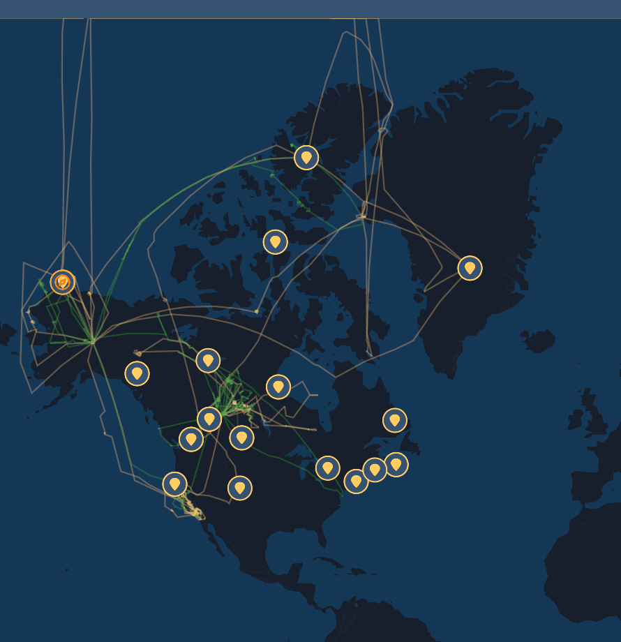
Example of the ARCTAS CASEI campaign map using the Web Mercator projection
When we first started searching for a solution, our initial idea was to use Mapbox Globe View. Mapbox introduced Globe View in 2022 and has since integrated it into the geojson.io platform. We were able to quickly test visualizing polar campaign data in geojson.io to inspect how Mapbox GL JS renders it on a globe.
The Web Mercator tiles don't cover the Earth between 85 and 90 degrees, so there is a visible “hole” in tile data near the poles. Although that hole looks filled when Mapbox GL JS renders the base map, the input geojson data is not rendered well at these latitudes, as demonstrated by the image.
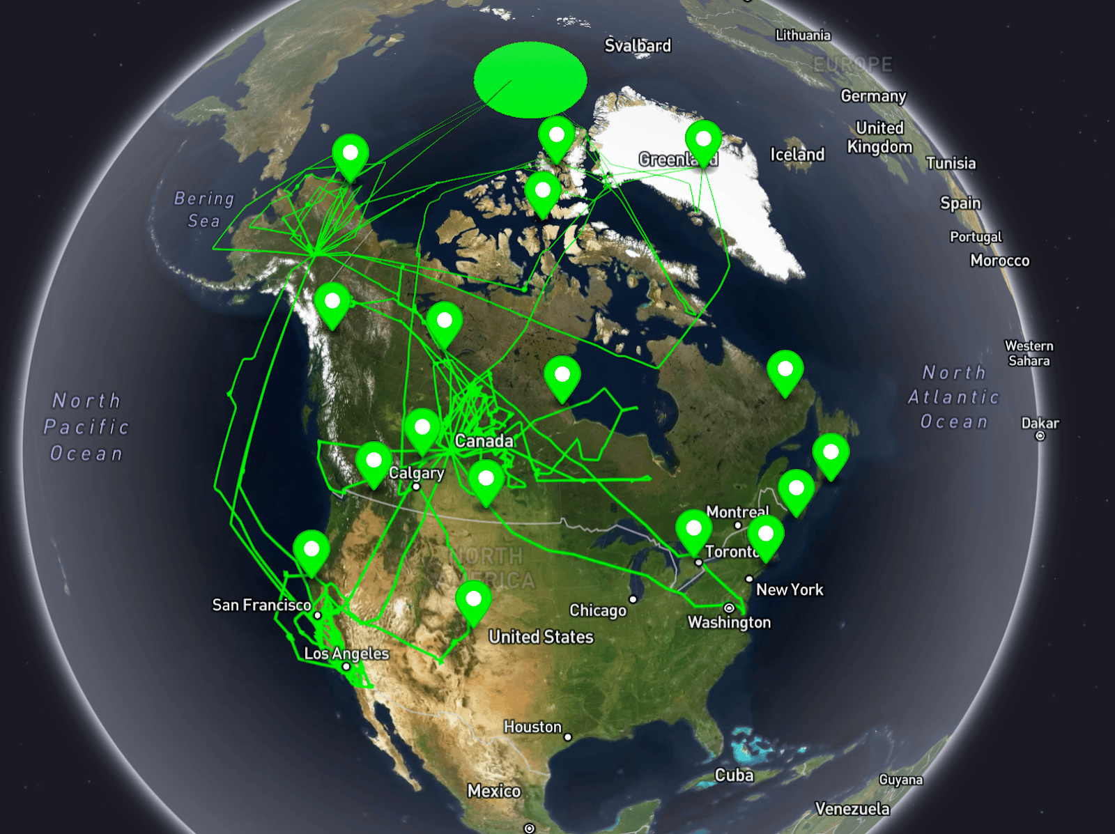
ARCTAS campaign map rendered with Mapbox GL-JS Globe View on geojson.io
The next step was to try the Globe View in MapLibre GL, which is not yet officially released, but will be in v5.0. MapLibre renders the base map and overlying data better than Mapbox GL. However, we can still see that data does not render correctly close to the poles.
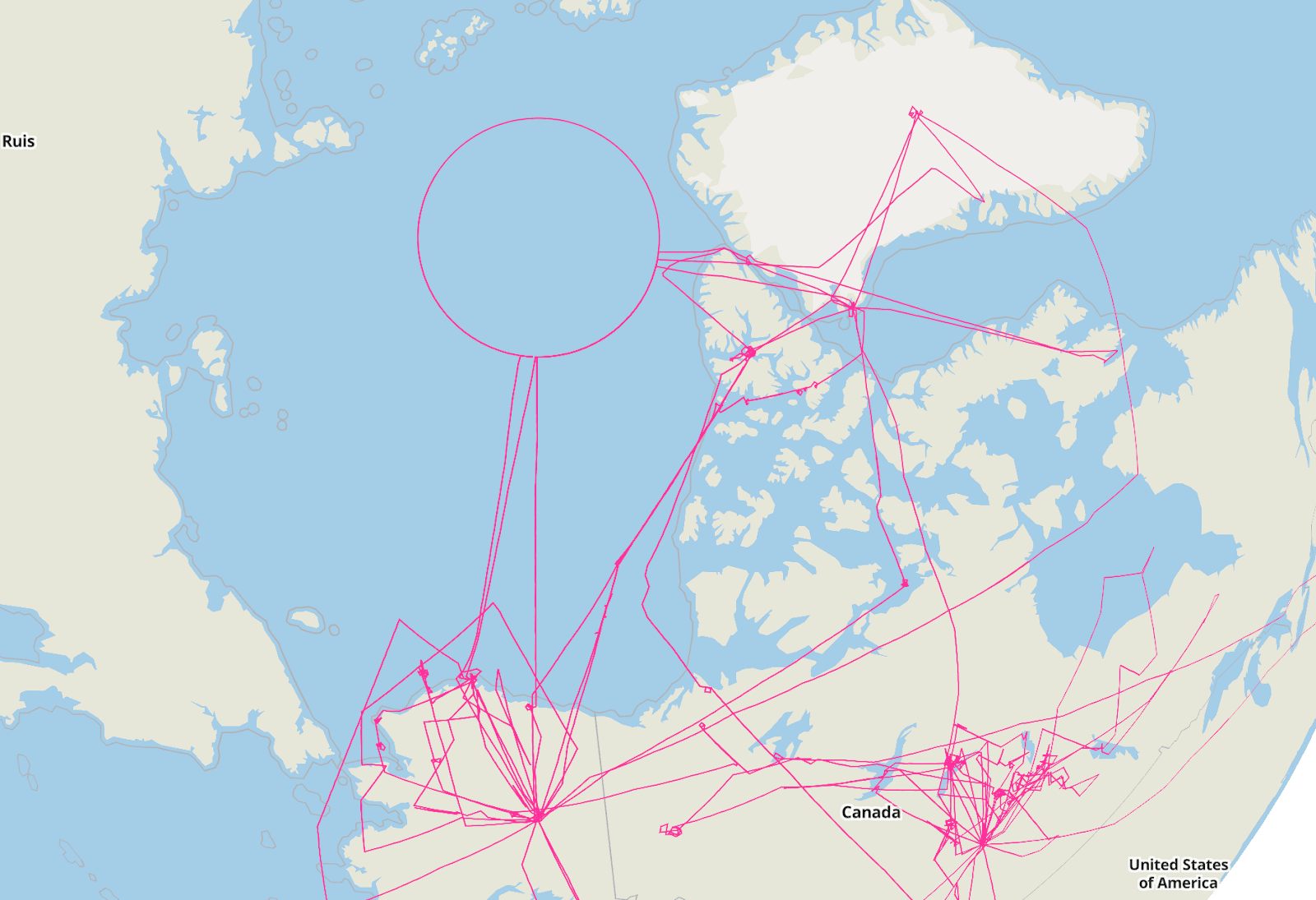
ARCTAS campaign flights rendered with MapLibre GL-JS using the Globe View
Finally, we investigated Deck.GL, as the Globe View example on its documentation site looked promising. In the documentation example a Natural Earth GeoJSON file is used in place of a base map to render water and land features across the planet. We added another layer with some flight tracks and verified that it correctly rendered the data close to the poles. As the Natural Earth base map was too simplistic, we explored adding the custom Mapbox Studio-designed base map tiles used in the CASEI application. We used the Deck.GL TileLayer, as Mapbox Studio provides a TMS service for the base maps.
At that point, we noticed two main rendering issues: there was still a visual hole close to the poles, and the map was distorted when we zoomed out.
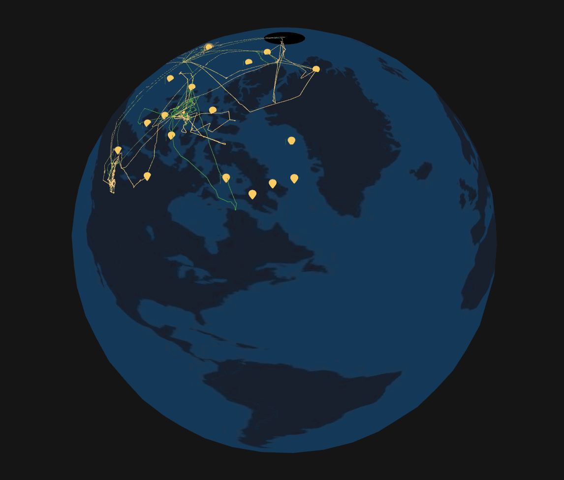
Our first attempt rendering Deck.GL’s globe view map with our custom Mapbox tiles. Note the hole in the North pole and the distortion in the South American continent.
We solved the distortion by setting the minimum zoom level as 3 and the map extent as [-180, -90, 180, 90], so it will use zoom 3 tiles for the entire world when the map is on zoom levels 0, 1, or 2. The extent parameter is needed to force the map to load zoom level 3 tiles on lower zoom levels. Otherwise, it will not load the tiles.
This is the resulting Deck.GL TileLayer code:
new TileLayer({
  id: "TileLayer",
  data: `https://api.mapbox.com/styles/v1/${styleID}/tiles/256/{z}/{x}/{y}@2x?access_token=${MAPBOX_TOKEN}`,
  maxZoom: 22,
  minZoom: 3,
  extent: [-180, -90, 180, 90],
  tileSize: 256,
})
Unfortunately, we were unable to find a solution to the “hole in the poles” problem, other than setting a similar color to the Deck.GL SimpleMeshLayer. This layer is simply a background for the Earth sphere. The hole is still visible from some angles, but it's subtle enough to not interfere with user workflows. While we also explored the fixes suggested by Deck.GL for issues with occlusion in globe view, these didn’t work for our data.
NASA CASEI
Resulting Globe View visualization of the AASE campaign using Deck.GL
Check out the Deck.GL implementation on some of the CASEI campaign pages live in production:
Experimenting with Globe View for Yourself
Globe View is a new feature. It has yet to be released on MapLibre GL JS, and it is still considered an experimental feature in Deck.GL. The MapLibre implementation appears promising, and it’s impressive that the results already show potential, building upon the existing Mapbox GL JS version.
Deck.GL was the only library that provided an adequate solution to visualizing data close to the Earth’s poles. However, its styling capabilities are very limited compared with MapLibre and Mapbox GL JS. Additionally, Deck.GL's vector tile rendering on globe view is also far from ideal, producing many noticeable visual artifacts.
For data that does not extend close to the Earth’s poles, MapLibre GL JS is an excellent first choice for an open source mapping library with lots of flexible features. However, data requiring precision in a non-Mercator projection may necessitate alternative solutions.
The code for this project is open-source. You can see our approach to the Globe View component in github.
Evolving Tools for Data Visualization
Since introducing Globe View on the CASEI platform, we’ve continued to refine it to enhance this view. Users can toggle between 2D and 3D views. When loading a campaign with platform deployment flight maps that cross either polar circle, the map automatically switches to a 3D view. We are working with NASA to enhance our understanding of how these tools are used in data visualization and analysis workflows, and we will continue improving the CASEI platform and hopefully apply what we learn to other NASA projects and beyond.
We love experimenting with new ways of rendering data on maps, and have done so for many years at Development Seed: our work on the Washington Post’s 2016 election maps led us to build out the Dirty Reprojectors tool, and our team member Kyle continues to push the boundaries of fast python geospatial rendering with Lonboard with some success in 3D data. Of course, the end goal of these efforts is never simply “to see if we could.” For climate scientists and other researchers using CASEI, accurate rendering of flight path data near the poles is essential to understand where data is collected and analyze its implications.
If you have a mapping challenge you’d like to explore, please reach out - we’d love to hear from you!
Related content
More for you
What we're doing.
Latest

