
Migrating humanitarians from desktop EO tools to distributed interactive geospatial systems.

Authors: John Crowley, Sajjad Anwar and Kiri Carini
John Crowley is a humanitarian technologist with over 20 years of experience rethinking information management and geospatial policies. We have worked with John on many projects over the years and recently engaged him to work on our ideas around adapting existing tools for disaster risk management. Thanks to John for his invaluable contributions to this blog post.
When Hurricane Beryl struck the Caribbean in early July, it was the region's earliest recorded Category 4 storm. By all appearances, earth observation systems performed as expected. Weather satellites fed data into models that accurately forecast its trajectory and changing strength. After repeated landfalls, a range of EO and SAR sensors enabled analysts to issue rapid damage assessments on multiple islands.
But behind the curtain was a different story: overworked teams cobbled together analytical products using decade-old tooling. They pulled data from myriad geoportals and field surveys and then used desktop GIS to build vector maps for responding organizations, including maps of closed roads, critical infrastructure, and displaced populations. Due to continuing distrust in AI algorithms and non-optimal workflows, they performed damage assessments manually. When donor appeals went out, all this work was condensed into written text and frozen into simple static PDFs each containing a few vector maps that outlined the damage, accompanied by eye-level photographs of people in need. Satellite imagery was siloed into a very small community of users.
For the humanitarian organizations we’ve talked to, such low usage of EO data is normal, familiar, and undesirable. We’ve heard this same story repeatedly over the past decade, so much so that even before this hurricane season, we started exploring how to fix it.
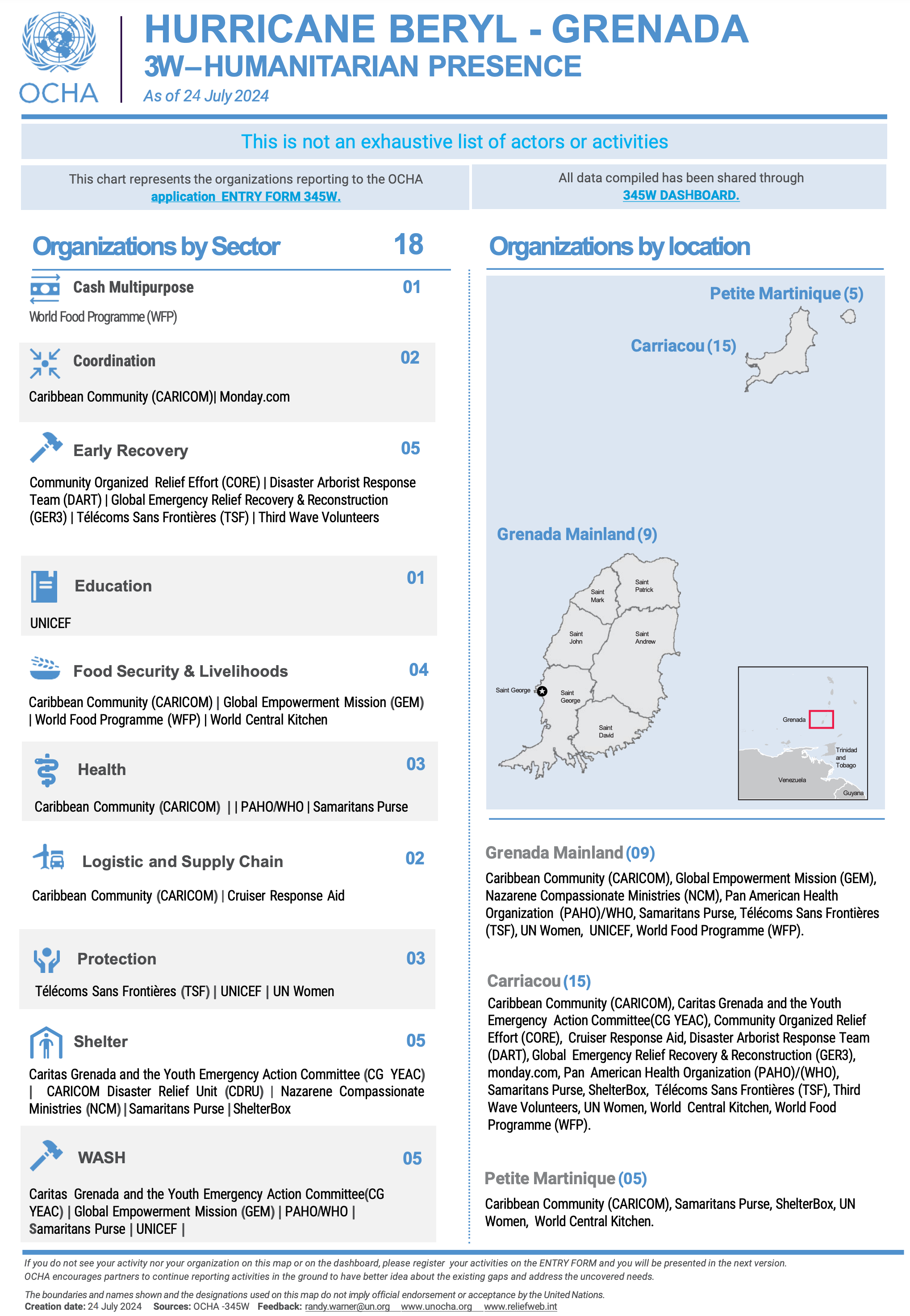
Fig. 1: A PDF describing Who Does What, Where (3W) during Hurricane Beryl
Characterizing the Problem
We interviewed 19 humanitarian and human rights organizations and explored why remote sensing data is not as well used as it could be in these critical sectors. The short answer is that EO workflows have not changed as quickly as EO capabilities.
Even with access to unprecedented volumes of data and steady EO industry investments, this data remains underutilized in the humanitarian sector. And methods remain rooted in old ways of working. In the words of one senior geospatial scientist, "Every day is Groundhog Day. Nothing has really changed in the past 15 years."
Business processes still center around analysts manually performing damage assessments using desktop GIS. The output still consists of one-off static products like PDF reports and dashboards. And leaders expect to have short prose descriptions of whatever the analyses show.
To further understand the dynamics our humanitarian clients are facing, we held a workshop in Geneva in May 2024.
We listened to humanitarian remote sensing experts discuss the impact of this desktop GIS approach on their work. We talked with Caribou Space about their comprehensive landscape report, Beyond Borders: Satellite Applications for Humanitarian Emergencies, which highlighted challenges around using EO data for crisis analysis. We also participated in a session on the challenges facing EO analysts regarding conflict and human rights.
We heard a litany of concerns:
We’ve heard this same story repeatedly, so before this hurricane season, we started exploring how to fix it.
Search: Data from EO providers are fragmented into silos. Finding the right image for the right place and time consumes too much precious analytical time.
Spatial and Temporal Coverage: The free imagery offered is tightly scoped by AOI and time. This makes model training difficult since the available pixels only reflect crisis conditions over a limited area and bounded time period. Change over time is required in highly dynamic contexts like refugee camps and informal settlements.
Model Inaccuracies: Analysts rarely have sufficient EO data to build models that can automate their work. Existing models need to be more accurate or updated more regularly to be trusted in a context where accountability for human lives outweighs the advantages of automation.
Analytical Talent: The talent pipeline is as critical as the data pipeline. Universities are not teaching the methods necessary to analyze disasters, conflicts, and other crises. Once EO experts develop skills for humanitarian analysis (usually on the job), they must use manual processes that drive a burn-out cycle.
Fragmentation of Effort: Humanitarian data contains data about vulnerable populations. Protecting already vulnerable persons against new threats often limits collaboration across organizational bounds, even when multiple organizations work on the same crisis and would benefit from sharing data and analyses. Compartmentalized IT systems amplify this problem: sharing sensitive data can be even more difficult when authentication systems force collaborators to use personal instances of online services; that is never a solution when analyzing sensitive data. As a result, analysts are often working in silos. Duplication of effort is a frequent result. Analytical methods exist within their own eddies in a larger stream, often without a means of sharing them beyond a few slides at a conference.
Throughout our discussions, it was clear that current EO toolsets are inadequate for the complexity of humanitarian work and that this gap is breaking already stressed teams. The existing tools for sharing geospatial information are not fit for purpose: most organizations use public versions of ArcGIS Online or CKAN-based platforms, such as the Humanitarian Data Exchange or MapAction’s Map and Data Repository, both of which are built on PHP and have geospatial capabilities bolted onto a core catalog. While these efforts are critical early steps in sharing geospatial data, they are not keeping pace with the sector's demands around building shared approaches to complex analyses.
Current EO toolsets are inadequate for the complexity of humanitarian work.
From desktop GIS to distributed interactive geospatial systems
When our team first tackled this challenge, we knew we had to center our work on a set of key goals. We also wanted to remain true to our role as a tool builder and impact enabler. So we defined our job in clear terms: to develop a way for organizations to plug their GIS teams into a distributed interactive systems for geospatial analysis that would allow each organization to outline what geospatial data, models, and analyses to share and which to keep private.
Rather than competing with existing centralized data infrastructure efforts like HDX and IFRC GO —which are already embedded in the community and costly to maintain—we opted for a different path. Our solution had to be decentralized, with costs shared among participating organizations, making it sustainable and accessible.
We wanted to create a collective solution that enabled participating organizations to address years of technical debt. Many humanitarian GIS teams are in a make-do mode after subscale investments geospatial infrastructure. Whatever we built would need to extend existing open-source tools and be cost-effective for an organization to implement and curate.
In a landscape marked by limited resources and organizational silos, we focused on enabling small teams of analysts to collaborate both within their multinational structures and across organizations. They must be able to build common archives of imagery and methodologies that can be aggregated, turning them into efficient, replicable processes. The best way to facilitate this collaboration would be to use interactive computing tools from open science.
It is not the first time we’ve tackled this problem. When NASA needed to create a way for scientists to search, access, and curate NASA’s massive archive of EO data to build a collective understanding of climate and crisis dynamics, our team created the eoAPI framework around the STAC specification.
This approach – now the core element of NASA VEDA – enabled four innovations:
-
With STAC, researchers could classify imagery according to rich metadata standards, enabling fast searching.
-
Imagery was stored as cloud-optimized GeoTIFFs, allowing efficient delivery of pixels.
-
Imagery could be accessed as dynamic raster and vector tiles, offering significant benefits to the scientific community. This approach allowed researchers to run algorithms on the data as they accessed it, enabling them to retrieve precisely the tiles they needed.
-
Imagery could be accessed from inside interactive computing environments (such as JupyterHub), enabling scientists to develop and share analytical methodologies and quickly build off each other’s work.
What is different here is that no one agency can host a central EO archive; the solution would need to be decentralized. As a result, this distributed interactive geospatial system would need two major additions to eoAPI:
Cross-institutional search
Given cloud costs, commercial imagery licensing limitations, and humanitarian agencies' reluctance to share sensitive data, analysts will unlikely ever share imagery across institutions at the pixel level. However, it is entirely possible to share metadata about each other’s catalogs.
This would enable two things. A shared mosaic of available imagery not only within one organization but also across multiple institutions. Additionally, it would allow analysts to build a catalog of their analyses, allowing these products to be accessed through a searchable catalog. Even if the analysis itself cannot be shared, knowing that someone has performed this work can enable analysts to contact each other and discuss potential collaboration.
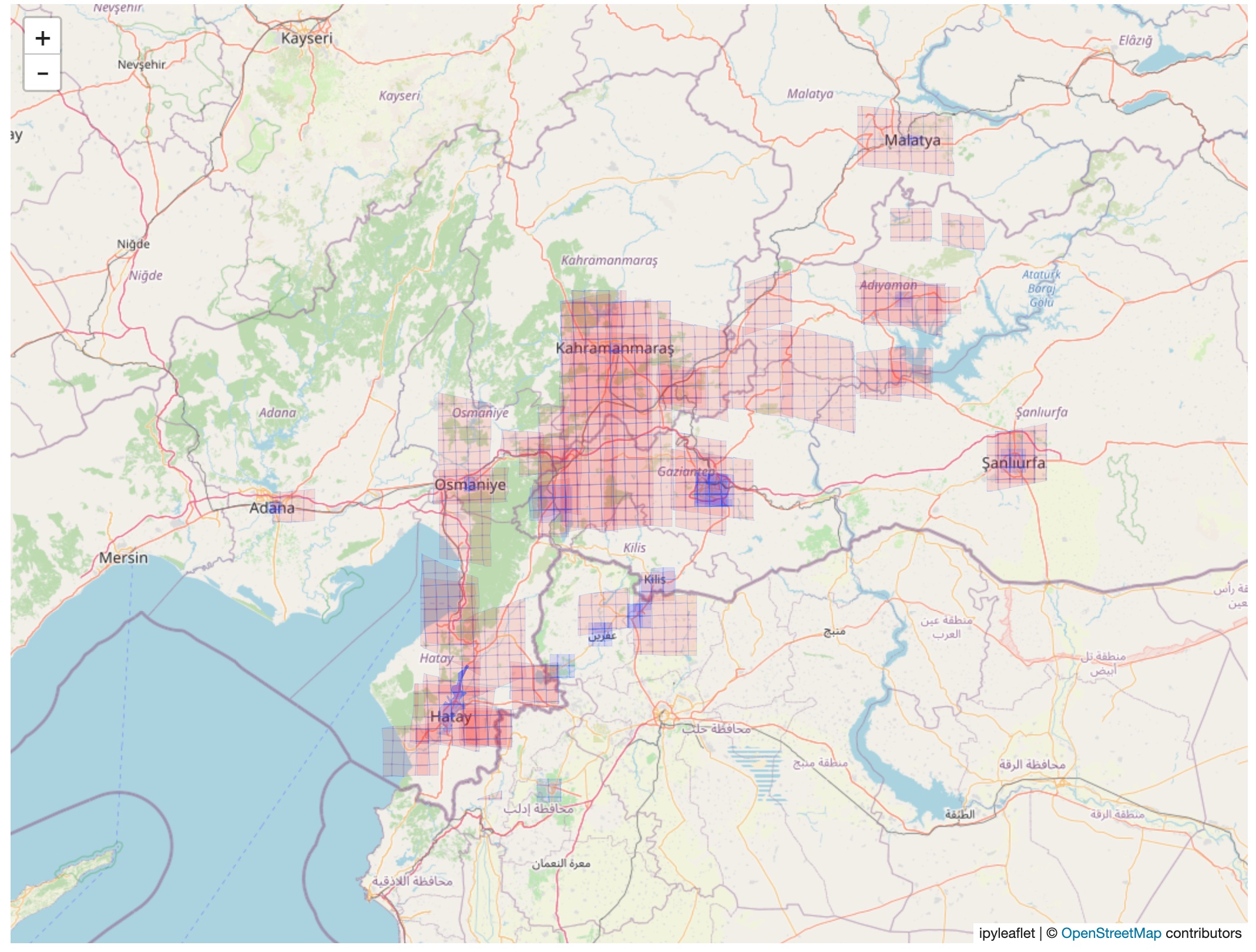
A Jupyter Notebook displaying the extent of available EO imagery before (red) and after (blue) an earthquake in Türkiye in 2022.
Shared Repository of Methodologies
Humanitarian GIS analysts are hungry for ways to work across organizations. While they expressed deep concerns about sharing sensitive data about vulnerable persons, they are eager to build on each other’s methodologies and want to ensure several dynamics:
Reproducibility: Ensure methods are implemented using consistent approaches that return reproducible results.
Flexibility: Quickly customize methods to the context of a particular crisis, including the place, time, and impact of a natural hazard or conflict.
Exploration: Engage in exploratory data analysis (EDA) with code/visual side-by-side, enabling them to codify their desktop GIS techniques into shareable, replicable scientific notebooks.
Offline accessibility: Mix cloud data access with local data access because humanitarians work in intermittent connectivity and often need to work on local machines and/or use inexpensive sandboxes to develop production code. We have been working with 2i2c on a JupyterHub-based approach to interactive computing, which would offer reproducible, flexible approaches to interactive, collaborative EDA.
The emerging idea for this decentralized interactive geospatial system (notionally called DIGS) would combine the benefits of a shared, cross-institutional imagery catalog with the power of interactive collaborative computing. DIGS could enable analysts to use their existing individual desktop GIS and engage in cross-institutional analysis–an aspiration of both humanitarian agencies and donors.
Building a Collaborative Future for More Resilient Humanitarian Response
As Hurricane Beryl demonstrated, the stakes are high, and the need for efficient, collaborative EO data analysis has never been greater. The limitations of current tools are not just technical—they have real consequences for the lives of people affected by crises. The IFRC GO platform platform and HDX’s Humanitarian API are building critical operational and data resources. DIGS will complement these efforts with standards-based metadata management and analysis systems that takes advantage of–and plugs directly into–the existing ecosystem.
DIGS aims to foster collaboration and improve the effectiveness of humanitarian responses. By enabling cross-institutional collaboration, improving data accessibility, and standardizing methodologies, we can transform crisis response from isolated efforts into coordinated and efficient collective action. Like all open-source projects, it will require a coalition of organizations to make it operational and funding to maintain each node in this decentralized system.
With DIGS, it is possible to imagine a future where, as the next hurricane approaches, humanitarian organizations can seamlessly access a wealth of standardized, high-quality EO data and proven analytical methods.
We invite EO experts, GIS analysts, humanitarian organizations, and technology partners to join us in developing and refining this DIGS concept. Your insights, experiences, and expertise are crucial in shaping a solution that meets the sector's needs. We want to hear from you. Reach out to us to share your thoughts or explore partnership opportunities.
What we're doing.
Latest