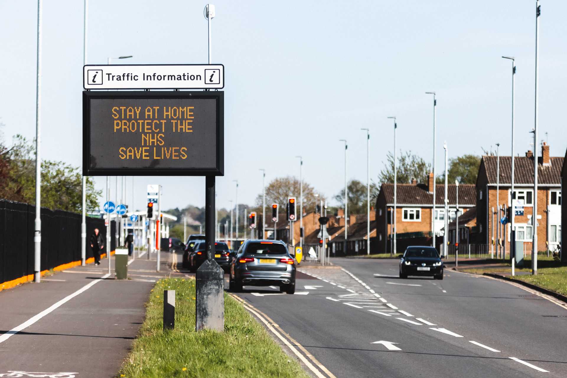
Analysis of 1129 US cities and counties shows diverging patterns in the relationship between mobility and infection.
Mobility data is a powerful tool for understanding and anticipating COVID infection rates. Mobility data from cell phone has been used to track the initial spread of the disease, to inform social distancing rules, and to evaluate the impact of recent protests for racial justice on disease spread. But not all movement is the same. As we work with governments and decision-makers to use mobility data for COVID planning, we have noticed a surprising trend. The relationship between movement and COVID infection rates is evolving along different paths in different locations.
Using movement data from our good friends at Mapbox, we analyzed movement patterns across 1129 cities and counties from pre-COVID through the current spike of cases. From this data, we created a unique “Movement-COVID Fingerprint” for these areas. These fingerprints show the very different paths that communities have taken through COVID response and recovery.
Our preliminary conclusions from our work with mobility data are:
-
At the beginning of the crisis, there was a strong correlation between decreased movement and a subsequent reduction of infection rates a few weeks later.
-
Over the past few months, some cities have been able to increase movement and maintain decreasing infection rates, while others have not.
-
Of a range of social and demographic indicators, lower social vulnerability and percentage of African American residents are most correlate with locations that maintain decreasing R(t) (transmission rate) while increasing movement.
-
Voting patterns are also correlated, but less so. Areas that vote primarily democratic are slightly more likely to have a favorable Movement-R(t) Fingerprint. This is consistent with other research that suggests that people who identify as Democrats are also more likely to wear a mask and maintain safe distances while moving.
Mobility data for COVID response
Movement restrictions are a critical tool for governments to combat the COVID-19 pandemic. However, these restrictions are extremely painful. Understandably, governments want to relax restrictions to the minimum level necessary to keep the virus under control. We’ve seen the best results from governments that have taken a highly data-driven approach to determining when and how to relax restrictions. Mobility data is extremely valuable for evaluating actual social distancing practice and fine-tuning policies to reopen the economy.
We use Mapbox Mobility Data with our partners. We like the Mapbox data because it is:
-
very high spatial resolution (to the city block)
-
frequent and fast (daily data delivered by next day)
-
privacy protecting (no personal data collected from the phone)
To support data-driven COVID response, Mapbox has created a new mobility dataset to measure social distancing practices under COVID. Mapbox Movement Index (MMI) is a mobility dataset to monitor population movement relative to pre-COVID movement rates, down to the city block. This data is incredibly useful when combined with data on infection rates, hospitalization rates and data on social vulnerability.
In the very beginning of the crisis, through the initial lockdown we saw a significant correlation between movement [MMI] at one point of time and infection rates [R(t)] roughly two weeks later.
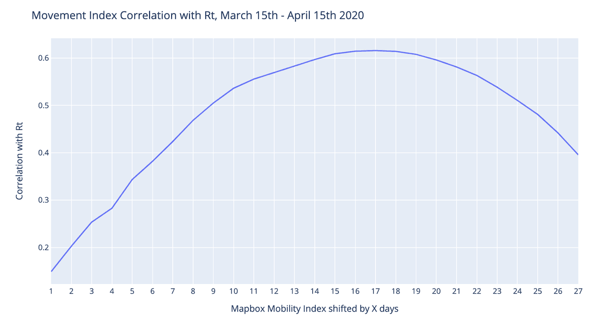 COVID-19 transmission rate (Rt) shows a strong relationship with movement patterns 14–21 days prior.
However over the course of reopening, we’ve seen this relationship diverge. Some locations have been able to increasing movement without a corresponding increase in R(t).
Movement-R(t) Fingerprints
An analysis tool that our partners have found particularly valuable, is a simple plot of the evolving relationship between movement and R(t) at the city level.
Epidemiologists and policymakers track the average ratio of new infections spread per person in a region, or R(t), to understand how the virus spread. Government and public health officials have all honed in on a goal of an R(t) of less than 1. An R(t) of 1 means that you’ve flattened the curve. Sustained rates above 1 mean that you are on a path to overwhelming your hospital system. The higher the number, the more quickly you will overwhelm the hospital system and the disease will be even more lethal. You can read more detailed explanations here.
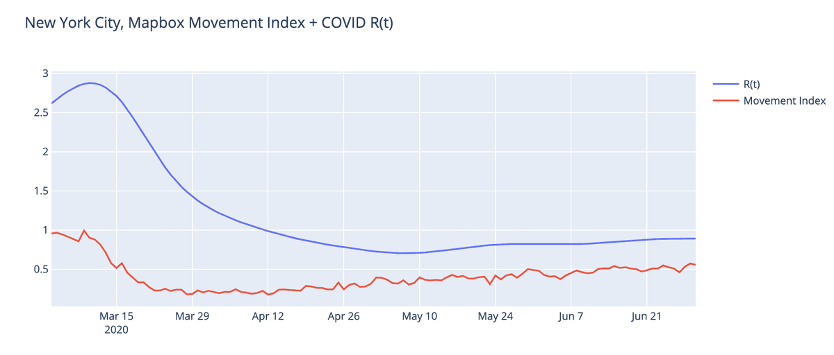
A standard time-series line chart can show both MMI and R(t) on the same chart.
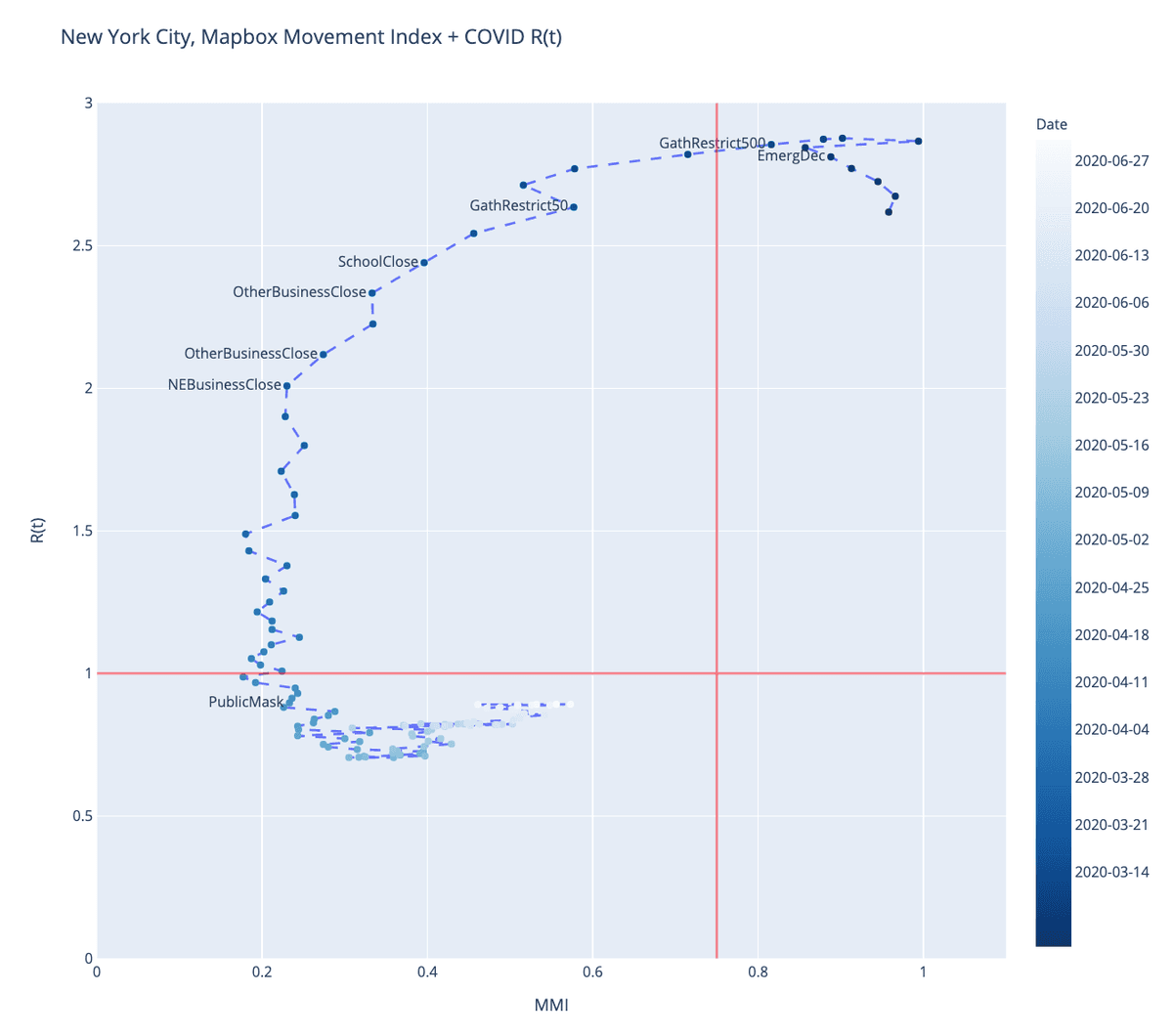
But this view of the data can slightly obscures the relationship between the two variables, and how they move with a time delay. We created an alternative “four quad” view. This chart plots the same MMI and R(t) values for each date as a scatter plot, connected by a line to show progress through time. We then annotate these scatter plots with policy decisions and thresholds to indicate broader patterns.
 Each point represents the MMI and R(t) values for one date. This chart is technically called a connected scatterplot, perhaps most famously illustrated by Hannah Fairfield in the New York Times.
Looking at the relationship between movement data and R(t) in this fashion provides a fine gauge on how movement and social distancing policies impact actual behavior and movement levels, and in turn how these translate into slowing COVID infection rates.
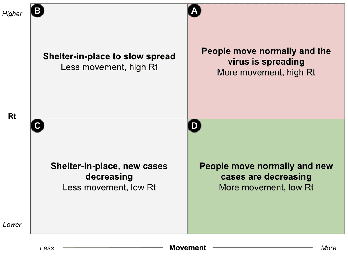
With this visualization, you hope for a C-shaped graph. At the start of the crisis, people are moving normally and the virus is spreading at its natural rate (R(t) of around 2). Cities and states then enact restrictions on gathering and movement. First, movement levels fall dramatically and within a few weeks these restrictions result in lower infection rates (movement from quadrants A→B→C). A well managed county can then gradually and carefully reopen. In these cases, movement increases without a subsequent increase in R(t) (A→B→C→D). If a county opens too early or too aggressively, infection rates could go back up (A→B→[C→D]→A). These patterns, especially when overlaid with policy decisions, can show us how effectively individual counties have responded to the pandemic.
New York, NY
New York City starts with high-movement and high-R(t). As social distancing policies are enacted, movement decreases, but it takes a few weeks for R(t) to catch up. Eventually once R(t) is below 1.0, movement restrictions can be eased while the resulting impact on R(t) is carefully tracked.

Washington, D.C.
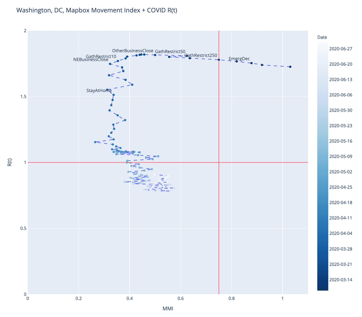
Washington, D.C. moves in a similar pattern. More restrictions imposed seemed to have slowed down movement, though not to the extent of NYC. Interestingly, the Stay At Home order seems to have been instituted after movement had already significantly decreased.
Harris County, TX
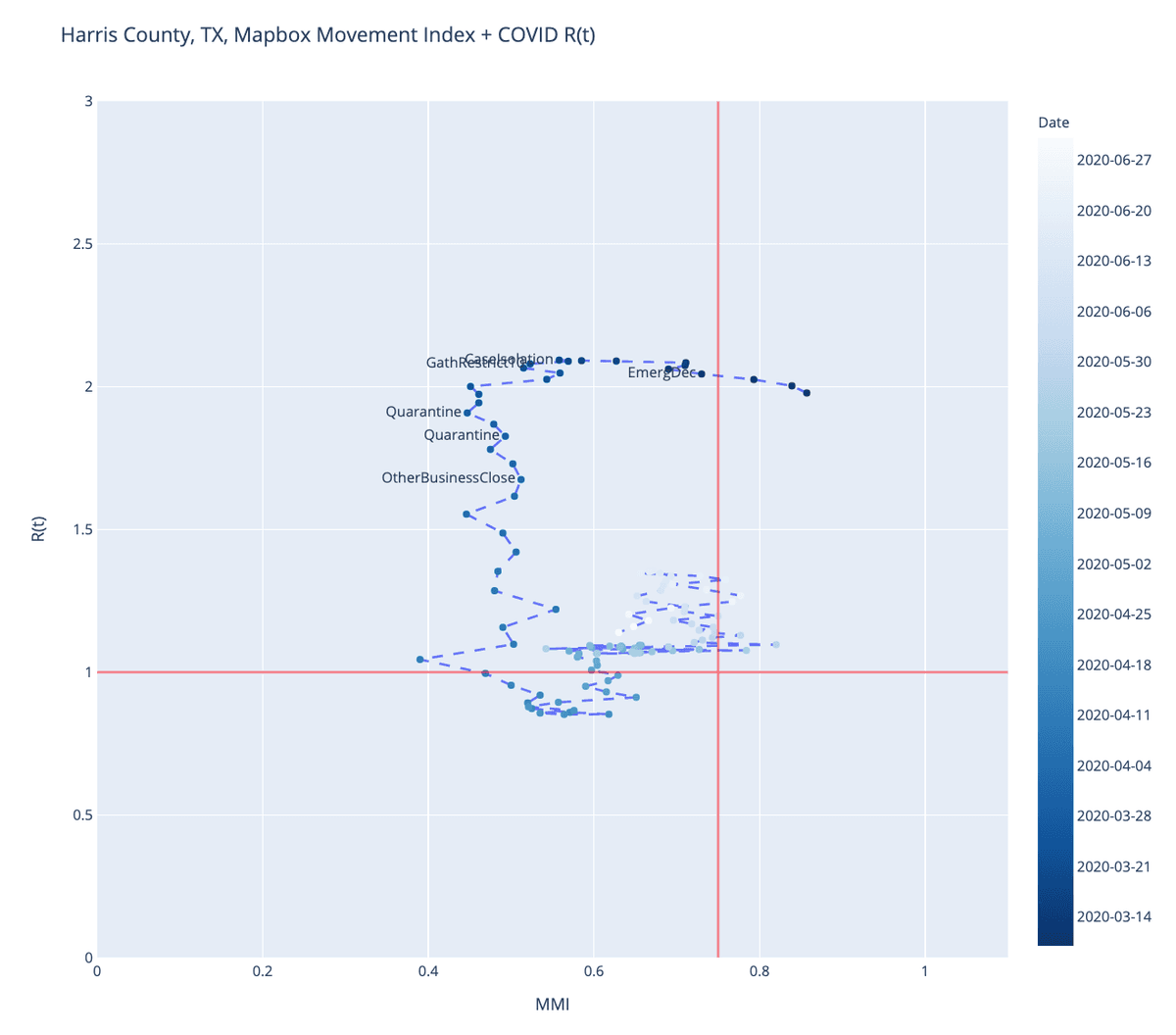
Harris County in Texas (home to Houston), represents a county where the curve hasn’t followed the same path. Movement only dropped to about half of the baseline, as opposed to 20–35% in DC in New York. The infection rate in Harris County continues to rise. A mask mandate was ordered on July 2nd.
Miami-Dade County, FL
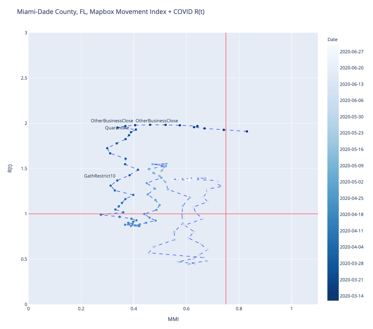
Miami-Dade County’s curve looks similar to Washington, DC for the first month. As movement starts increasing, there is a sharp rise in R(t). It subsequently falls for a two week period before rising again.
Divergent Reopening experiences
In April and May, fingerprints followed predictable patterns. A significant decrease in mobility would eventually be followed by a steady decline in R(t). Cities that did not reduce movement would churn in a high R(t) cycle.
In June and July we’ve seen a greater divergence in experience. Overall movement has increased in most cities and counties. However some counties were able to increase movement while keeping R(t) low. Others were not.
This suggests that not all “re-opening” is the same. How people move about and interact matters. In addition to where they are going, what activities they engage in, and critically what precautions they take to safely go back into public can have significant effects on resulting transmission rates. Do people wear masks in public? Do they keep a safe distance? Do they avoid crowded indoor spaces?
What factors lead to “good reopening”
This divergence presents a critically important research question for safely reopening an economy. What practices allow a community to maintain low infection rates even as you increase the movement and economic activity? It isn’t enough to study locations that have low infection rates vs. high infection rates. It is more interesting to study communities that have been able to increase movement while maintaining low R(t), to understand what allows them to achieve this. Essentially, what are the characteristics that allow an area to break the relationship between movement and disease rates. This provides hope for developing safer ways to reopen the economy.
We looked at a range of demographic, economic, and social indicators to determine which best correlate with places that have managed to break this relationship across 1129 cities and counties in the US.
Our preliminary findings suggest that:
-
Areas with vulnerable populations are harder to reopen safely. A county’s Social Vulnerability Index (SVI) score was the most predictive factor on whether increased movement would lead to increased transmission rates.
-
Numerous studies suggest that Black and Brown people are disproportionately paying the cost of COVID. Our analysis is consistent with that finding, in that areas with a higher percentage of African Americans were less likely to escape the movement/COVID relationship.
-
Areas that tend to vote for Democrats were slightly more likely to be areas that fared better as movement increased. This is consistent with other research that finds that people who identify as Democrats are more likely to trust public health officials and are more likely to engage in practices like wearing masks.
-
Restaurants probably deserve scrutiny. For the small subset of cities where restaurants reservation data is available, restaurant reservation trends were highly correlated with disease trends. That doesn’t necessarily mean that restaurants are worse than other locations. We didn’t have any data that would allow us to look at attendance at gyms, bars, tattoo parlors, libraries, or grocery stores.
There is more research to do. We will continue to investigate how communities reopen safely and would love to team up with other researcher and policymakers. Please contact us if you’d like to collaborate.
R(t) data from the CovidActNow API
What we're doing.
Latest

