Good illustrations carry a lot of weight. They communicate complex concepts and capture complex emotions. When you are use an illustration as a reward, it is all the more important to be thoughtful about the feelings that illustration inspires.
We recently launched real-time analytics for Missing Maps, a project that grows the community of humanitarian mappers around OpenStreetMap (OSM). As a part of the projects, we created a badge reward system that highlights the achievements of Missing Maps contributors. We created a style for these badges that would recognize the contributions of mappers, while also acknowledging that badges aren’t the primary reason that they participate. We also developed a style that is guided by collaborative design principles and is ready for others to contribute.

Rewarding heroes
Our reward system was designed to recognize the contributions of humanitarian mappers, while being clear that we know they aren’t doing it for the badge. We needed to focus the badges on the real-world impact and contributions these mappers were having. We designed it to be fun and encouraging, while also recognizing that mapping would sometimes be done in the aftermath of disasters with devastating consequences.
Friendly, unique, and engaging
The Missing Maps badge system provides a showcase for the work a person has made in contributing to OSM. A badge can provide a small milestone for what they can map next and can be an encouragement to map more. This can help cut down how repetitive, seemingly endless, and often thankless mapping out the world in OSM can be. Badges can help break up a long night of disaster mapping, or can let people know that it is time to take a break.
We felt the badges should have a welcoming quality because MissingMaps relies heavily on volunteer effort. MissingMaps encourages contributions by making Mapathons fun, communal events (often with pizza). The importance of the work is the initial hook, but it’s the welcoming community that keeps people coming back, and the badges should reflect that.
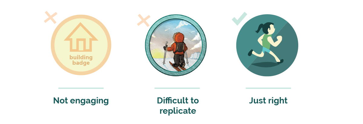
To make the badges feel like rewards we felt they needed to look interesting, unique, and beautifully designed. Something substantial that can feel more like a reward than a colored circle with text on top might. To this end, the badges were drawn in a modern style but with a fluid, non-gridded style to emphasize that each badge is a unique and thoughtful thing, created lovingly by hand.

Principles for Missing Maps badges
Designing for future contributors is like designing for an internal team where you don’t know who teammates are going to be. We created guidelines, a template for getting started, and examples that serve as blueprints. We created a style that fits with the Missing Maps brand while capturing the goals of any reward system — make it friendly, make it feel substantial, and tell a story to keep the user engaged. And to keep it accessible for future contributors, we made it straightforward and open.
Consistency & Simplicity
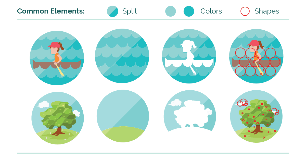
We used a consistent and simple style for the Missing Maps user page badges to ease the burden on a contributor to make graphics that fit within the system. The elements that make up this style can be anything from line widths, to patterns, or other visual cues. For Missing Maps badges we use a color and the visual cues to create the sense of unity.

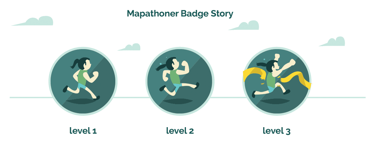
Most of the badges are tiered, providing a natural flow to tell a story between badges of the same category. For example, our users are rewarded the “mapathoner badge” for attending mapathons. There are three levels for this badge, each rewarded for attending 5, 20, and 50 mapathons respectively. The badges for these levels each features a common character that starts out in a slight jog, then a sweating sprint, and finally reaches a finish line. This provokes the user to get to the next level in order to find out what might happen next, and also makes the badges feel like part of a set.

Open Source
By making the badges entirely in digital tools and in the svg format we ensured most artists who would want to contribute to the project start out on a level playing field. There aren’t any fancy filters, proprietary fonts, or program-exclusive styling on these graphics.
We’ve documented rules and guidelines for creating future badges and provided a template file for getting started. Everything is marked out on Github and available for anyone to contribute. Watch the repository for upcoming opportunities to work on new badges.
What we're doing.
Latest