

Real-time data is great. Building real-time interfaces is hard.
We are working with The Washington Post to build tools for the company’s live election coverage of the US primary elections. The Washington Post wanted to create a experience that was informative and highly visual and aimed at readers following election coverage on a mobile phone or tablet device and often while watching another screen. Our challenge was to build a real-time data app that engages users and make it easy to track the most important information. Inspired by interactions and visual presentation from fantasy football apps, we designed tools for live election tracking that make it clear when the data is changing and provide contextual information to make these changes understandable.
Reporting live events through data
We noticed similarities between the football games were were tracking and the primaries we were building for. There is a winner. The results unfold over 2–4 hours. There are close games and blowouts. These situations can translate into interesting events during a primary race. For example, when the lead frequently flips or when a candidate outperforms expectations.
With any time based event, what piques a user’s interest isn’t necessary what happens during one point in time but how the data or information changes moment-by-moment. Sports apps address these challenges on a daily basis. We formed a small fantasy football league, to practice tracking multiple games simultaneously through apps and websites. We evaluate how these apps informed users of real-time updates. A regular NFL Sunday became our preparation for Super Tuesday. We were frustrated by the apps that made it hard to track multiple games simultaneously. We loved the apps that showed us what had happened since the last update. The best apps had a clear hierarchy of information. They showed an overview of all the games but allowed you to easily dig in and flip between games. The best apps were selective about what data to show at what level. They let you know where the ball is, how much time is left, who is in ‘the red zone’, and what games are worth watching.
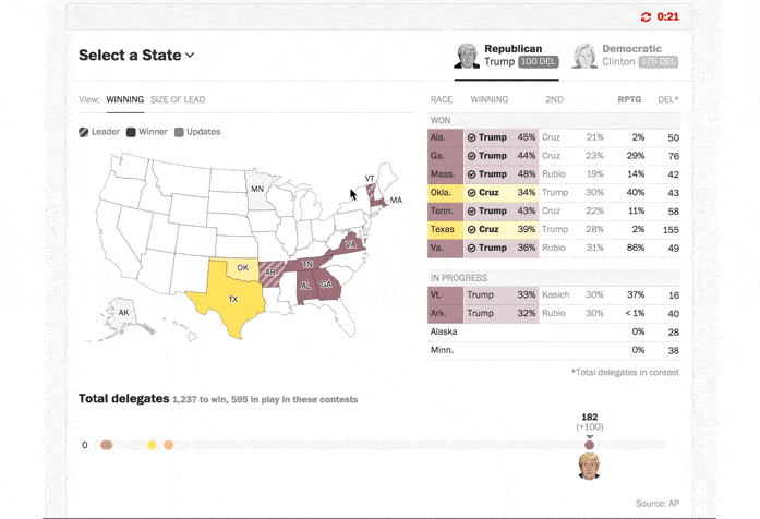
We translated our findings from football tracking to election tracking. Election data can be overwhelming when results come in all at once from thousands of counties, across multiple states, for a plethora of candidates. We started with a clean interface that was selective about what data to show at the national and state level.
Highlighting New Information
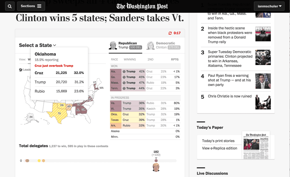
To make sure users are always up to date on the most important action, just like in the fantasy football apps, we introduced a design tool to highlight counties where something meaningful was taking place. If the leading candidates are within 1% of each other, a candidate has just overtaken another candidate, or the race has been called, that county receives a highlight on the map and an annotation in the tooltip. This was a way to highlight the ‘red zone’ in an election race. It offers a clean, non-intrusive way to help the Post’s readers make a little more sense out of the results coming in and to not miss any of the action.
Context layers
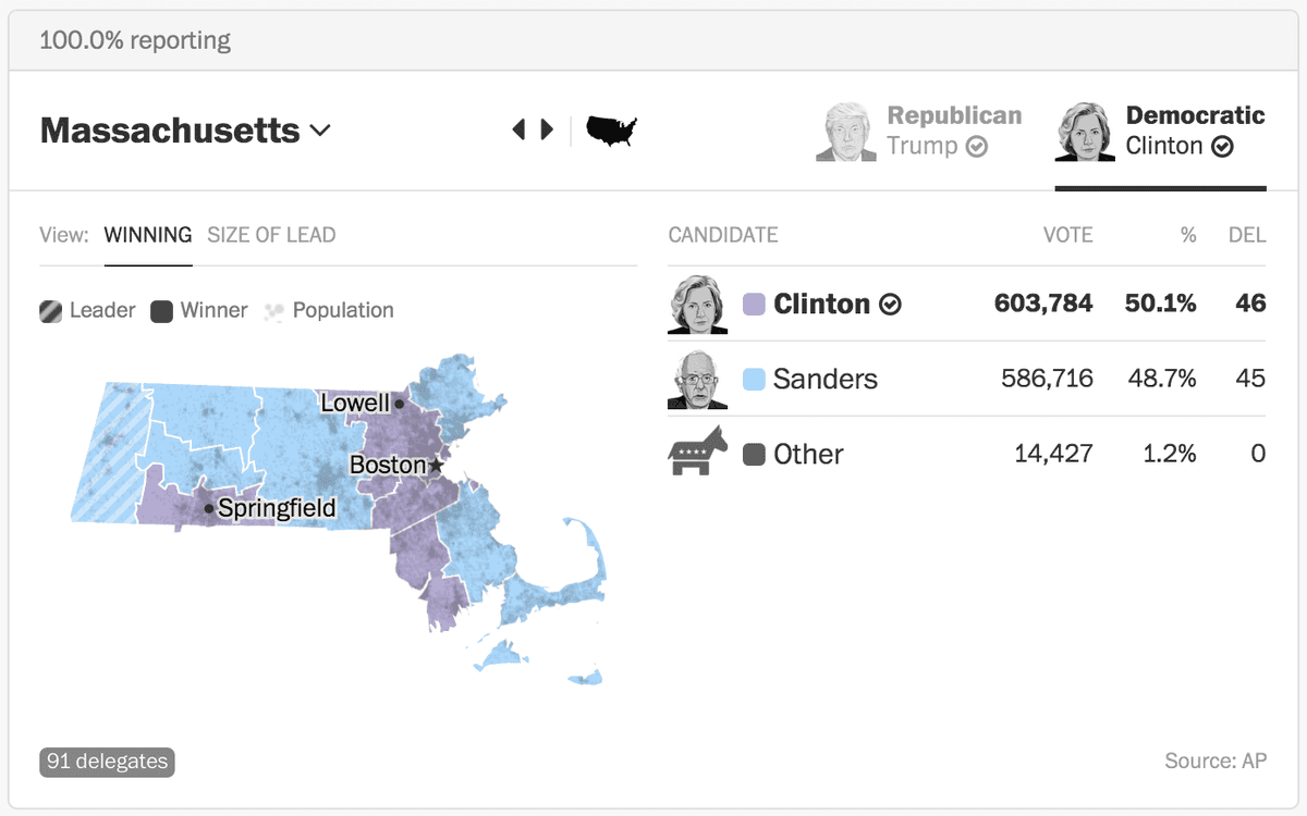
The main map view shows who is winning in each county. This has the advantage of being extremely easy to understand and track over time. The disadvantage of this kind of map is that it can misrepresent the importance of large, rural counties with few votes. To compensate for this we added a population layer to give users more context for results. We used a light population stippling to give users a clean visual cues of which counties would have more votes. We continuously adjusted color palette, opacity, and shade of the data layer and the population stripling to make sure this layer stood out without mudding the map. We started with more saturated colors but ended up going with much lighter tones by Super Tuesday to allow the population layer to really shine through.
With many republican candidates and a tight democratic race, precise maps and a focused narrative are more important than ever. We hope the population layer and real-time curated updates give users the right visual cues to give them a better understanding of election data coming in night by night. You can try the app tonight on The Washington Post website while you track results from Florida, Illinois, Missouri, North Carolina, and Ohio.
What we're doing.
Latest