On Saturday, Afghanistan went in large numbers to vote for a new president and provincial representatives. While the elections were widely seen to be a success, there were numerous reports of shortages in ballot papers.
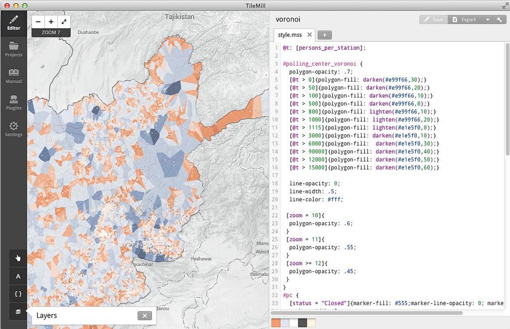
By analyzing the placement of polling centers along with high resolution population information, we can project where people are likely to vote. This polling coverage map shows stations likely to have a shortage of ballots in blue, and stations likely to have a surplus in orange.
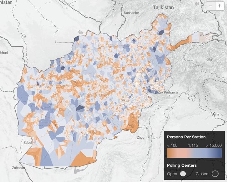
Overburdened Stations
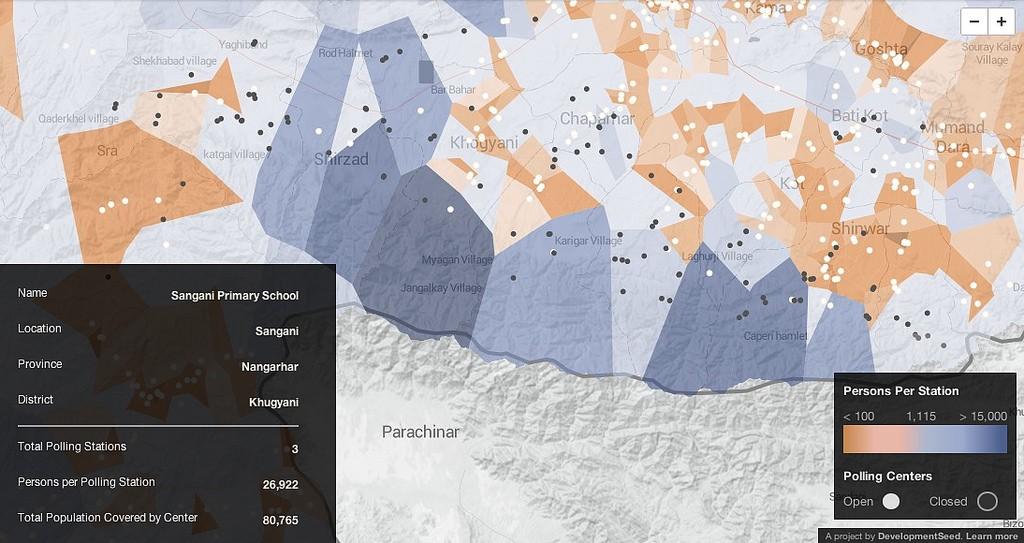
This map also shows the impact of closing 352 polling stations in the week leading to elections. It shows where closed polling centers, displayed as black dots, have burdened nearby polling centers. For example, the polling center at Sangani Primary School has 3 stations to accommodate over 80,000 people. That’s nearly 27,000 people per polling station. Polling stations were each issued 600 ballots.
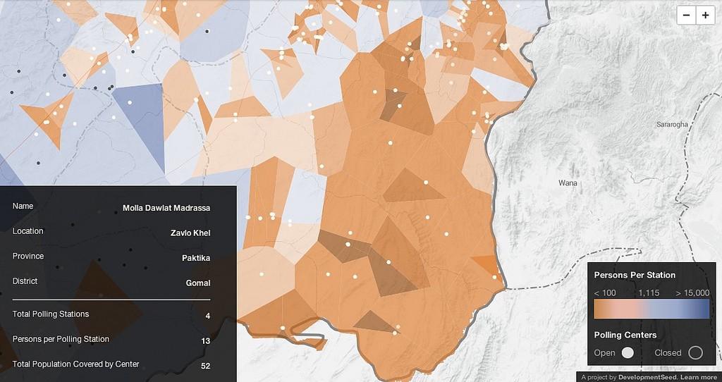
Bright orange polygons, with many more ballots than likely voters, are areas to watch for potential ballot box stuffing.
How we built this map
We built this map from open data. There is a rich set of data available at Afghanistan Open Data Project, its GitHub repo, and NDI’s Afghanistan Election Data.
For this map we used 2014 Polling Center locations and created voronoi polygons around each polling center using QGIS. The voronoi polygons show the each area for which the polling center is the closest option. This represents the swath of the country likely to go to that polling center.
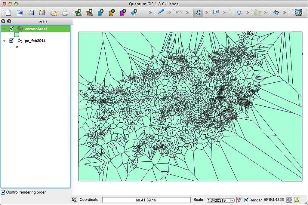
To see how many people live within each Voronoi polygon, we used the WorldPop Afghanistan population layer which provides population data to 100m grids. We used the QGIS zonal statistics module to compute the population within each polygon.
Finally, we translated raw population numbers into the burden on each polling center. Polling centers have one or more polling stations. Each polling station has 600 voting ballots. Just over 53% of the population is registered to vote. On average, a polling center would need one station for every 1,115 people in the area it serves. We used TileMill to style polygons blue for areas with more than 1,115 people per station, or orange for stations with fewer than 1,115 people per station.
The methodology section provides additional information on the data and processing required to make this map.
What we're doing.
Latest