
Design Decisions for Mapping Temperature and Precipitation at Durban
- Estimated
- 4 min read
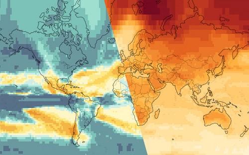
The primary focus of the temperature and precipitation maps launched by the World Bank on Friday at the COP-17 meetings in Durban is of course the data being visualized. In the case of climate4development.worldbank.org, this is the projected global temperature change by the end of this century. English Labels + Temperature Anomaly (Scenario A2) Edit descriptionapi.tiles.mapbox.com
Temperature change in 2100 assuming a world with a continuously increasing global population and regionally oriented economic growth (scenario A2).
The maps are designed to be highly interactive, allowing users to hover over different parts of the world to get a more detailed look at the yearly annual trends. To achieve this we’re using the Google API to generate line graphs on the fly from data stored in the map. Check out our tutorial to try this on your own maps.
In this post I’ll outline some of the design decisions I made with the maps on this site and some tips for approaching similar maps when designing maps with TileMill. This is especially actionable since the World Bank opened up a significant amount of the data we used to make these maps in the site’s /open section.
Data layer as the base layer
The data layers are 2x2 degree grids covering land and ocean. We decided to provide only minimal geopolitical context — an overlay of coastlines and international borders, which are composited on top of the data. With this approach, the data takes the spotlight with full opacity and rich, bold colors. Compared to the traditional mashup approach of transparent overlays on a more complex baselayer, we have a much cleaner result. We are also keeping things modular — any changes that need to be made to the borders style happen in one place instead of a dozen.
Coloring a changing planet
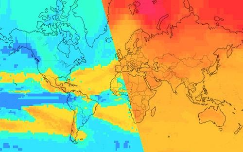
Both the temperature and precipitation maps show projected change in median measurements, so I chose a diverging color scale where white indicates no change and the darkest colors indicate the most change. For temperature this diverging scale ended up being completely one-sided — there is no grid cell where the climate models project a decrease. For precipitation, darker shades of blue indicate areas projected to receive more precipitation, and darker shades of yellow indicate areas projected to receive less.
Color schemes used to show projected precipitation change (left) and temperature change (right).
The color scales I have chosen shift hue somewhat, but the primary contrast between steps is in the brightness of the color. I find maps like this to be more readable when brightness change is used in this way because the darker areas immediately stand out — and the darker areas are the ones we want to draw attention to. Compare the above designs to a version where only hue shift is used as a differentiator.
Scale appropriate datasources
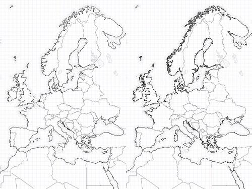
The transparent context overlay contains coastlines and lakes from Natural Earth and international land borders from the World Bank. Natural Earth data is distributed at three scales: 1:110 million, 1:50 million, and 1:10 million. I used all three scales at appropriate zoom levels in order to avoid detailed areas of coastline clustering into dark blobs. I’m also showing large lakes depending on zoom level according to their Natural Earth assigned Scale Rank — smaller lakes are hidden at lower zoom levels.
Patterns
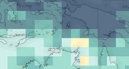
Our data layers cover both land and ocean. We want to show these numbers equally, but still orient the viewer as to where land and water are. This can get a bit confusing if we’re overlaying lines alone, so I made a series of buffers around the land layer and applied a semi-transparent wavy pattern fill to illustrate which side of the coastline is water and which is land.
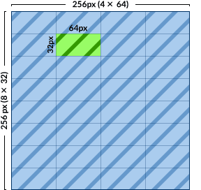
A piece of advice of using patterns with TileMill — make sure the pixel dimensions of your pattern can evenly divide 256, the size of a single tile. Then use the polygon-pattern-alignment: global; Carto style to ensure that patterns in different geometries will line up with each other. Example: a pattern image with pixel dimensions of 64x32 will tile neatly.
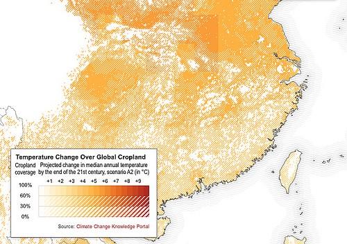
A few of the maps patterns were also used to indicate other information on top of the base maps. In this example, we are showing the regular temperature baselayer with an overlay of solid and striped white masking out certain areas. Areas where more color shows through indicate areas with higher percentages of cropland cover.
Do it yourself with TileMill
All of these climate maps from the World Bank were designed in TileMill, our open-source map design studio. MapBox Hosting and Wax provide the compositing and interactive elements of the maps. For further details on using TileMill to make your own maps, check out our full documentation.
What we're doing.
Latest