
Africa.mixmarket.org launched this week, providing one of the first continent-wide visualizations of the microfinance landscape in Africa. This builds off the work we did with the Microfinance Information Exchange (MIX) this summer mapping microfinance in Nigeria, which is experiencing rapid growth in the sector, with Nigeria.mixmarket.org. But overall Africa receives only seven percent of global investments in microfinance. By providing detailed, transparent information on microfinance in Africa and visualizing it, MIX hopes to help grow microfinance and financial inclusion in the region.
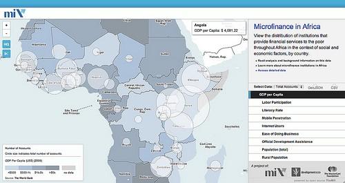
The homepage of Africa.mixmarket.org features a map of Africa, which provides a regional look at financial services available that are targeted to the poor. MIX’s data set has almost 23,000 providers reaching more than 70 million clients and includes data on many information and unregulated providers as well.
Visitors are able to toggle the map from the total number of accounts and the total number of providers, both at the country level. This data is paired with a wide-range of socio-economic data provided openly by the World Bank via data.worldbank.org, such as GDP per capita, population, mobile phone penetration, and six other data sets — which are displayed as choropleths and let users dig down to get a better understanding of the financial situation in each country. This map can be embedded on any website, allowing MIX’s partners, policy makers, investors, and anyone else use this visualization.
Number of microfinance providers laid upon GDP per capita. Do the poor have sufficient access?
Providing access to open data
One of MIX’s goals with this project is to provide information on microfinance in Africa that currently was not accessible. All of the data included on the map is available to download in either geojson or csv format through links on the homepage. Additionally, MIX provides a link to their raw data — which is a great resource for those wanting to dig deeper and run their own analysis — as well a detailed description of the analysis they ran on the data.
Built with open source
The map on Africa.mixmarket.org was created using the open source map design studio TileMill and is shared online using the map hosting service TileStream. You can access the individual map tiles used on MIX’s Africa map from their TileStream account. The website is built with the bare minimum of HTML, CSS, and JavaScript, and uses Wax — a toolset for putting maps on the web.
For more information on MIX’s work on this site, check out their press release about the project. Stay tuned for more maps of the microfinance landscape as we continue to work closely with MIX to visualize the field in other areas of the world.
What we're doing.
Latest