

Climate change is a reality. Businesses and governments are already spending large amounts of money to build up resilience to it, and they will spend more as understanding of the changing climate grows. Yesterday’s launch of the Global Adaptation Index, (gain.globalai.org), provides a powerful navigational tool designed to guide policy and private sector capital to the places where it will have the greatest impact on adaptation.
This new index, released by the Global Adaptation Institute, is not just a ranking of 161 countries’ ability to adapt, it is a multi-faceted tool that breaks down the index to show countries’ specific vulnerability to climate change and their readiness to receive investments in resilience improving measures. It is based on 38 carefully selected indicators to measure factors like food security, infrastructure, and governance that all weigh in on a country’s risk and ability to adapt. The site itself also shows our latest thinking around data browsers, and how to design and build them to better see data in context.
A video of yesterday’s launch of the Global Adaptation Index, where the team behind the index explains the data, the problem, and the initiative’s goals.
We led the strategy, design, and build of gain.globalai.org with private and public sector decision makers in mind as the main audience. At the same time we knew we needed to expose the inner workings of the index to researchers and subject matter experts.
The challenge was to design an application that gives a high level overview of a country’s performance while allowing users to drill down layer by layer to the actual formulas that make up the index, to see the real meat of the data. With both of our teams fully embracing an agile, goal oriented design and build process, we were able to quickly deliver a site that:
-
Explains the Global Adaptation Index to a diverse audience
-
Provides a fast interface to explore all indicators making up the index
-
Is as transparent and open as possible
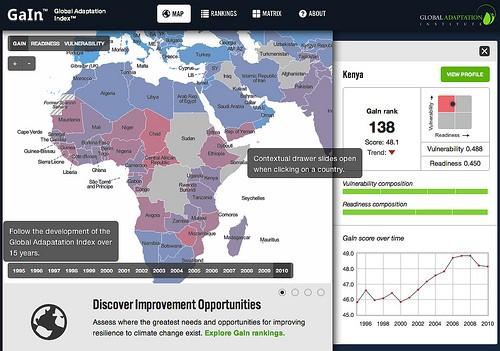
Mapping the index
Through a map on the front page, we give a very quick and direct view of the Global Adaptation Index: it is global, it is a score applied on a country by country basis, and it goes back 15 years. Clicking on a country will not actually jump to a country page but will reveal a country summary in a drawer that slides out to the right of the map. We use this drawer paradigm throughout the site to add rich, contextual information without having users leave the page — and keeping the browsing experience very fast.
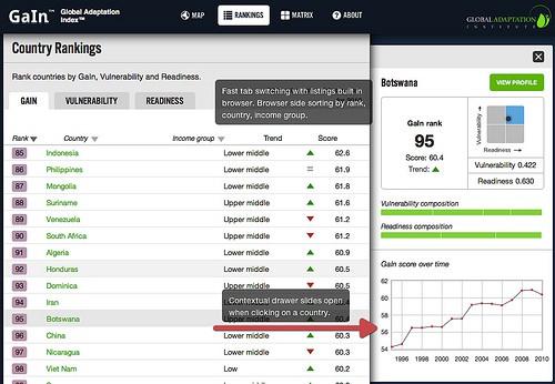
Rankings
Country rankings by the Global Adaptation Index, vulnerability, and readiness are the core pieces of the site. A typical user will switch back and forth between these tabs to change country rankings, take a closer look at where specific countries stand, and compare them.
We focussed on speed of use. The site’s thin server architecture delivers the entire application on the first visit. Every subsequent jump between pages is completely built in the web browser, with the only thing being requested from the server being the actual data. This approach really shines on the ranking pages — while they are very long, it is incredibly fast to click between tabs. Sorts of the data are happening completely within the browser, and we are again using the drawer to show rich country data without leaving the page.
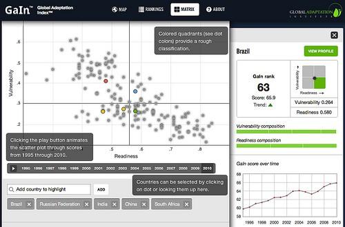
Readiness matrix
While rankings are a one dimensional way of comparing countries, the matrix plots countries along their vulnerability and readiness axis. This allows for a more subtle comparison, answering which high vulnerability countries are more ready than others and why. The data goes back 15 years and allows for animating the development over time.
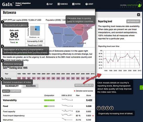
Country profiles
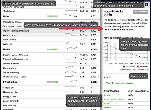
This section allows users to learn more about specific countries, and it shows the composition of the Global Adaptation Index all the way down to the single indicators that make it up. Sparklines give an intuitive overview of indicator development. Clicking on a sector like “food” or an indicator like “malnutrition” reveals details in the side bar drawer, including a description, a larger time series graph, a source link, and a list of similar countries for this particular indicator. This last piece, together with the clickable mini map on top of a country profile, create a useful way to navigate the site laterally and explore countries’ Global Adaptation Index by geographic or statistical proximity.
Using open data
The launch of the Global Adaptation Index is a great win from an open data perspective. The index itself is freely available in CSV format under a very liberal Creative Commons Attribution 3.0 license.
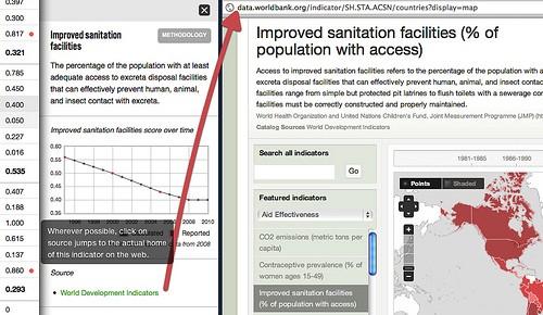
Wherever possible, we link indicators not just to their source, but to their actual home on the internet, bringing more transparency to the data. This is particularly exciting for us because we link data.worldbank.org, another open data site we built. What emerges then — and one of the reasons open data is so fascinating — is a network of openly available, linked resources that gives access to data across the traditional boundaries of web properties.
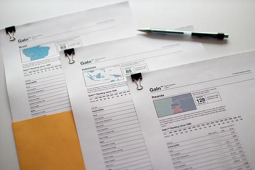
Print friendly
We use print stylesheets to streamline the site’s look for print media. A printed country page looks and feels like a made-for-print briefing and is a great resource to provide at meetings or conferences.
Built with open source
We built gain.globalai.org with node.js using server side Javascript. All data is stored in CouchDB. The site has a thin server architecture running Backbone.js with Bones, and it is being hosted with Nginx. The Readiness matrix was built with d3. All maps on the site were built using TileMill, our open source map design studio.
Further reading
For more information about the Global Adaptation Index, we recommend you check out these resources:
-
Global Adaptation Index enables better data-driven decisions, O’Reilly Radar
-
Is Your Country Prepared For Climate Change?, Fast Company
-
Global Adaptation Leaders Unveil Index to help Private, Public Sectors Prioritize Investments in Adaptation, Global Adaptation Institute
What we're doing.
Latest