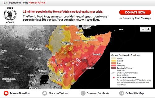
We just launched horn.wfp.org, a map visualizing the massive impact of the humanitarian crisis and highlighting critical operation locations in the Horn of Africa. The famine declaration, which went into effect in certain areas in late July, indicates that thousands of people are starving and dying every day. Many international organizations, including our partner on this site the World Food Programme, the food aid arm of the United Nations, expect the famine to impact millions of people.

A look at horn.wfp.org, showing current food security conditions across the regions and World Food Programme distribution centers
With this map we aim to make it easier to understand and communicate the complex situation around the famine by combining situational data with operational data. On Tuesday we released five situational maps showing the impact of the drought and crisis, and this map combines that information with the locations of food distribution centers and actual aid needed to feed the hungry.
Our goal with this new map is to give people a window into the crisis at a regional level, while simultaneously providing the ability to view and understand the growing crisis at the country and province level to see WFP’s latest operational information. Combining situational data with operational data has the power to drive decision-making and resource allocation in times of crisis.
Using the estimates from the Famine Early Warning System Network (FEWS NET) and the Food Security and Nutrition Survey Unit — Somalia (FSNAU), coupled with data from the UN Office of Humanitarian Coordination and Affairs (UN OCHA) illustrating areas of restricted aid access, our map shows not only the severity of the crisis but also the ways in which the World Food Programme is responding.
This is about more than just creating a new map. This map makes information actionable and makes its easy to see both the extent of the crisis and the response to it. It allows people to quickly find information about how to easily contribute much needed donations to support aid efforts on the ground, and see where those donations are actually going. In the Horn of Africa, the World Food Programme can feed one person for one day with just $0.50. Using this map it is possible to see what is needed budget wise to feed those in need, and how close the World Food Programme is in achieving this. Going forward, new location and shipment data will be posted in near real-time, keeping the data as accurate as possible.
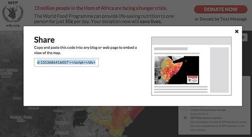
We are trying to make this data viral to better help those impacted by the famine, and designed the site to encourage others to get involved through social media or to share the interactive map by embedding it elsewhere on the web. Please consider embedding this map and sharing it with friends.

The map can quickly be embedded like a YouTube video into any website
Here’s a look at the embedded map:
To further this goal, the map tiles used in horn.wfp.org are also publicly available, and can be embedded in any site on their own or with additional data added to them. For more information on this, check out the blog post I wrote Tuesday about this, or download the maps directly from MapBox’s TileStream map gallery. You can also sign up here to stay engaged with our response efforts.
We’re honored to be working closely with the World Food Programme to communicate about a complex crisis situation and motivate people to take action in helping feed those in need. Open data combined with open-source tools (all the maps were made using TileMill and are hosted by MapBox) make it easy to integrate data-driven decision making and communicate a message.
If you can spare $5 or $10, please consider contributing to this cause and helping spread the word about how others can help.
What we're doing.
Latest
