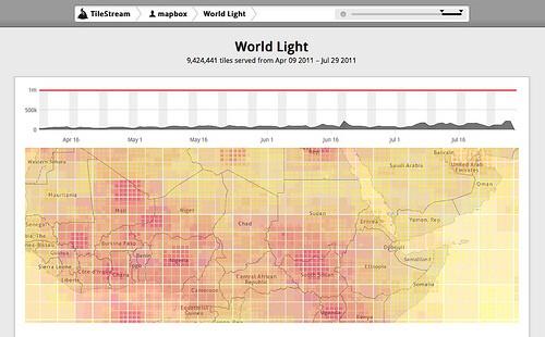
We just upgraded TileStream Hosting’s analytics dashboard to better visualize how people are interacting with your maps. Now each tileset has a heat map, which shows where people are drilling down and panning. The heat map is the central focus of the dashboard, and it’s composited with your actual tiles so you can see the details of exactly what people are looking.

In this map you can see how people are zooming down into South Sudan. This is no surprise since SouthernSudan2011.com is using the World Light map tileset, which AJ updated on July 9th to include the new country, and they are the top link on the New York Times’s South Sudan feature.
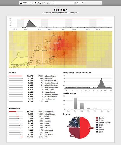
In addition to the heat map improvement, we also gave the overall TileStream UI a refresh and made it a little snappier. The dashboard still shows traditional analytics like what websites are using your embed widgets, daily and weekly traffic figures, browser statistics, and what country people are browsing from.

In this example, you can see tile requests kick up for JapanEarthquakeRecovery.com after Alex Howard blogged about TileMill on O’Reilly Radar and embedded the map in the post. And it’s no surprise to see people are zooming into Fukushima area of the map.
For more information on TileStream hosting, check out the website and past blog posts about the service.
What we're doing.
Latest