Since May TileMill — our open source map design studio — has supported putting interactive popups on maps. Having an interactive space like this creates endless possibilities for visualizing your data and communicating your message. Recently we’ve been working on a few projects where we’ve taken advantage of this space to display charts and graphs of attribute data made using Google’s Image Chart API.
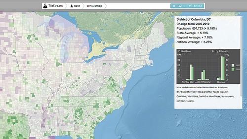
The Chart API allows you to build charts of your data quickly and easily, and when combined with TileMill, put these charts on a map in the form of interactive popups. Little to no programming experience is needed to adjust an existing chart in Google’s gallery or build one from scratch in their interactive chart playground. Any way you build it, the code can be easily inserted into the interactivity space in TileMill to add a chart to your map like the one you see below showing data from Washington, DC on a map of national Census data.
How it works
The Chart API generates an image based on the data that is sent via a URL request. Within the URL, parameters are set and data variables are defined. This request then returns a PNG image of a chart based on that data. This means that a basic chart consists of only a few components: a base URL, chart type, chart size, data values, and data labels.
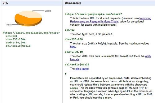
The great thing is that you don’t have to go deep into code to create simple visualizations. The simplicity of the components and parameters provides a unique way to bring interactivity to your map.
Creating a chart
You can create a basic chart either by using the Chart Wizard or by taking an existing chart from the gallery and editing it to suit your needs. Additionally, Google offers a playground to test and check changes quickly. You can then stylize the chart and add more information to it using HTML. Additional tabular data can accompany the image to add context and display the data values.
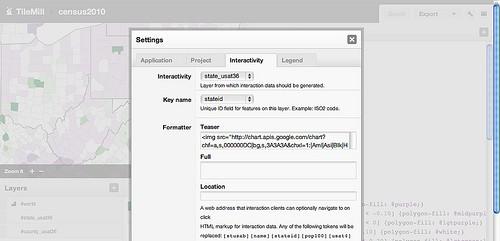
The URL that comes out of this process can be put into an image tag that can be added to the interactivity section in TileMill, which you can access the interactivity menu through the Settings menu in TileMill.
To learn more about the basics of making a map, see support.mapbox.com.
Simple charts from a lot of data
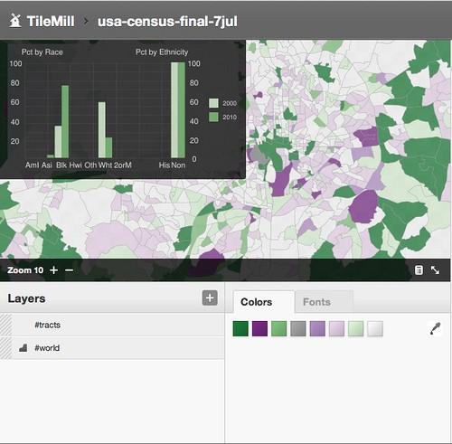
In our soon-to-be-released Census 2010 map, we wanted to add an interactive graph that shows the individual race/ethnicity change. To add more context, we decided to show the change from the 2000 Census data. What’s incredible is that in a simple URL request we can create a graph of 18 variables of data showing the change over ten years.
Designing Interactivity
A key component to having a great interactivity section is selecting the type of data and the message you want to communicate. In the case of the Census map, we wanted to show contextual data as you look at total population change, but total population only tells part of the story. Race and ethnicity is collected in the Census and having that information at your fingertips is critical to understanding the full picture of the data.
As a part of the Census data that USA Today complied and cleaned, Census 2000 data was also included with the Census 2010 data. This was a lot of data that needed to be displayed together to provide a great story. For the visual effect, we decided that a bar chart with two axes would be communicate the data. For your projects, pie or line graphs may be the best way to visualize your data. The Chart API provides numerous formats of charts ranging from line and scatter charts, to pie and radar charts. I styled my chart like this:
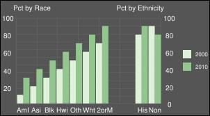
For a step-by-step walk through on how this chart was created, check out the documentation available on support.mapbox.com. The code to build a similar chart is also available there. Feel free to copy and paste it into the live playground and give it a try.
We’re excited about the visual possibilities that the Charts API provides in telling complex stories with data. To get started, download TileMill, check out Google’s Image Chart API, and test out the different ways to visualize your data.
What we're doing.
Latest
