Using Excess Federal Properties to Show the Benefits of TileMill's Interactivity
- Estimated
- 3 min read
Recently the White House released a listing of nearly 14,000 properties owned by the government that aren’t being used. President Obama has proposed getting rid of these excess properties, which could mean $15 billion in savings over the course of three years. As part of this announcement, the White House developed an interactive map of the properties’ locations with summaries of the total amount of properties in each state and ZIP code.
The map on WhiteHouse.gov plots points dynamically from data in its web content management system on top of a freely-available MapBox base layer map. Instructions on how to do this are available on support.mapbox.com. The White House also released a full spreadsheet of this data, and we decided to have some fun with it.
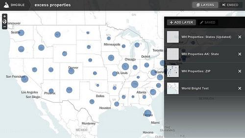
This is a map of the excess properties made using TileMill and hosted on TileStream Hosting. To make this map, we downloaded the spreadsheet data from WhiteHouse.gov, converted it to a geospatial file, and then created the map in TileMill. Using TileMill to create a map like this has a number of advantages:
-
Fast rendering of thousands of points
-
Multiple layers of interactivity
-
Easily embeddable maps
Let’s take a look at each of these in some more detail.
Fast rendering of thousands of points
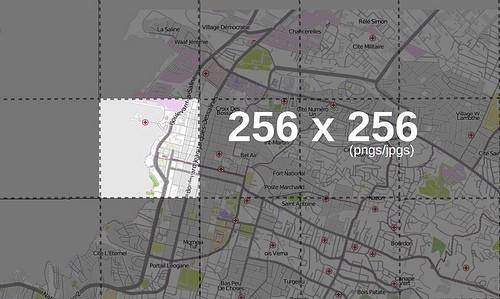
One of the most obvious differences between the excess property map made in TileMill and the map made using dynamic data is that the TileMill map supports thousands of points, allowing for really fast interactivity, even on older browsers. This is because maps made in TileMill and exported as MBTiles are made up of a grid of image tiles, and an image tile may have several points.

Maps made in TileMill and exported as MBTiles are made up of a grid of image tiles
So instead of your browser trying to render separate images for each point, it only needs to render ten or so tile images for a standard computer screen display. The difference between ten files versus thousands on a single web page makes a huge impact on the speed at which the map is displayed.
A MBTiles file also contains interactivity data, so overlays and on-click popups travel with the map as it is embedded, or soon, displayed on the MapBox iPad App. In the case of our excess property map, this means we can show all ZIP code summaries across the country in one view.
Multiple layers of interactivity
As you zoom deeper into the excess property map, the state summaries yield to ZIP code summaries with both layers having interactive points. This is done by using the map maker feature in TileStream Hosting, which layers multiple tilesets.

We exported the state summaries layer from TileMill at 0–4 zoom levels, and the ZIP code summaries at 5–10. The base layer supports all of these levels, so as you zoom in the base layer stays present while the state summary layer disappears and the ZIP code summary layer appears. Both layers are exported with interactivity for a seamless user experience.
Easily embeddable maps
TileStream Hosting provides a simple embed code for all maps. This makes it easy for you to embed your map on your own website, like we did above, or offer the code to other people to use on their own websites. Check out Alex Howard’s blog post on GovFresh for an example of this map embedded on another site. Visit this map on TileStream Hosting to make your own embed code.
Rebuilding the White House excess property map gave us a great opportunity to show the benefits of tile-based maps — including speed and density of points, layers of interaction, and embeddable code. Alternatively, the WhiteHouse.gov map show’s how easily MapBox base layer maps can be integrated into your own CMS. In both cases, the maps are interactive and feature a custom design that helps tell the story of this data.
What we're doing.
Latest