Adding Pie Charts to Map Tiles: Using SVG, Inkscape, and Tilecache
- Estimated
- 4 min read
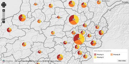
In the public release of AfghanistanElectionData.org, which went live in December, we made a unique set tiles displaying pie charts showing official complaints surrounding the recent election in Afghanistan. This data pushed us to expand our tile generating process. Here is a run down of how we piped the data though Inkscape and automated the stylesheet generation for the charts.
First, I’ll provide a little background information on the data so you can understand the problem. The complaints made by Afghans to the Electoral Complaints Commission have been categorized by province, and we felt a map would be beneficial in illustrating their distribution. However, each complaint has also been assigned a priority — A, B, and C for high, medium, and low, respectively. This is an interesting distinction within the total numbers, but we didn’t have a good way to illustrate it with our existing MapBox tileset workflow.

I came up with a method to generate pie charts using SVG and Inkscape and at the same time generate a Cascadenik stylesheet to render into a set of map tiles. These charts were placed on the map as Mapnik point symbolizers, with their size representing the total number of complaints for that province, and the wedge within representing the distribution of priorities.
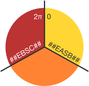
To make the pie charts I took advantage of Inkscape’s internal extensions to SVG, specifically with regard to the definition of arcs. I created a basic template pie chart with three wedges in Inkscape, saved it as an SVG, then opened it my text editor. I replaced the values that would change with strings that would be unique and easy to find and in a regular expression search. For example, I put “##EASB##” where the value would be “End A Start B”.
Note that only Inkscape (and possibly its predecessor, Sodipodi) would be able to render these SVG as they are intended to look, since the parameters we are changing are specific to those programs. Other renderers will simply show the original template shapes. For my purposes this was not a problem, since SVG is only a temporary intermediate format for these shapes.
Preparing the data
I had to manipulate the data a bit in OpenOffice Calc in order to make the numbers useful for Inkscape. The complaint subtotals needed to be converted to radians, since that is how Inkscape stores arc angles. This was done by dividing the priority subtotal by the total complaints, then multiplying by 2π. These angles then needed to be further adjusted to correspond to their position in the pie:
-
Wedge A starts at 0 and ends at its arc width in radians
-
Wedge B starts at Wedge A’s value and ends at its arc width plus Wedge A’s arc width.
-
Wedge C starts at the total arc of wedges A and B, and ends at approximately 6.283 radians (2π).

To adjust the size of the charts, I created additional columns in the spreadsheet to hold the desired pixel diameter to export at various zoom levels. This was calculated by first determining the range of total complaints across all 34 provinces, converting each individual province’s total to a percentage of that range, then applying that percentage to appropriate minimums and maximums for each zoom level.
Generating the charts
Once all the data was in place, I automated the process of rendering the pie charts and writing the Cascadenik stylesheet with a shell script. The spreadsheet was exported to a tab-separated values text file to be readable by awk.
The script iterates through columns of each line in the TSV and passes appropriate values to a function that:
-
Runs a search and replace for the arc angles on the template SVG and saves the result to a temporary file.
-
Exports the temporary file to a PNG with Inkscape, adjusting the width and height according to the value defined in the TSV.
-
Adds a line to a Cascadenik stylesheet that points to the exported PNG from the corresponding province and zoom level.
The result was 136 pie charts — four for each of the 34 provinces to accommodate different zoom levels on the final map. I also added numbers to the stylesheet to give a more accurate sense of scale. The final tiles were rendered using Mapbox TileMill.
This particular case demonstrates the usefulness of command-line scriptability for even desktop graphics applications like Inkscape. There are probably dedicated programming libraries for generating charts that I could have researched and used instead, but there is value in being able to stick with the tools one is familiar with to maximize focus and momentum on the project itself.
What we're doing.
Latest