


Explore the complexities and solutions behind visualizing flight tracks for NASA's airborne and field investigations on CASEI.

The complexity and variability of NASA's airborne data make it challenging for scientists to visualize and utilize this critical information.
The Catalog of Archived Suborbital Earth Science Investigations (CASEI), managed by NASA's Airborne Data Management Group (ADMG) within the Interagency Implementation and Advanced Concepts Team (IMPACT) at Marshall Space Flight Center, is a comprehensive inventory of NASA's airborne and field campaigns. It is crucial for facilitating the discovery, access, and utilization of archived data, supporting researchers in answering new science questions, and studying changes in Earth's systems over time. CASEI includes a web-based interface offering a searchable contextual metadata inventory for the more than 50-year history of NASA’s airborne and field activities. The inventory includes thorough, curated contextual information about campaigns as well as details about instruments and platforms often used in suborbital Earth science research.
In suborbital investigations, the platforms on which scientific instruments are mounted can be stationary, like buoys and field sites, or they can be non-stationary structures, such as aircraft, balloons, vehicles, and ships. Campaigns involving non-stationary platforms can be complex, gathering data over multiple geographical areas over different dates and times. The ability to visualize deployment patterns for these platforms aids scientists in understanding the scope of campaigns and pinpointing the most useful data for their research.
Scientists can pinpoint the most relevant data for their research by visualizing deployment patterns.
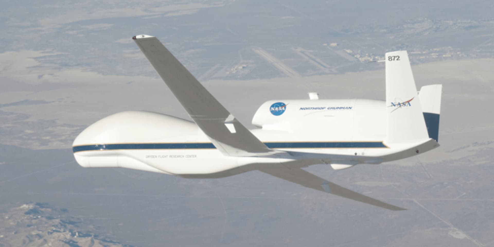
Fig. 1: The Global Hawk is a platform cataloged in CASEI that was deployed on numerous campaigns, including HS3, GRIP, ATTREX, EPOCH and GloPac. NASA Photograph by Carla Thomas.
The Challenge of Visualizing Flight Tracks for Airborne Data
Field investigations often rely on NASA aircraft equipped with instruments to study a wide array of geophysical phenomena, such as atmospheric, oceanic, land, vegetation, and/or ice processes. The aircraft typically follow predetermined flight paths to gather as much useful data as possible. When illustrated on a map, these flight paths are called flight tracks, and they can tell engaging stories about the campaign. This visual representation of where data collections occur includes attributes such as time and location.
Accessing accurate navigational data for NASA’s airborne campaigns poses some unique challenges. The data are distributed across NASA’s Distributed Active Archive Centers (DAACs) that manage airborne campaign data, and each archive hosts data in a variety of formats and structures. Each campaign also consists of many overlapping tracks, which makes visualizing the numerous tracks more challenging. This variability makes it difficult to automatically access and read navigational datasets required to generate flight tracks for each campaign.
Current Data Solutions
We experimented with navigational data for a few campaigns to identify and overcome hurdles associated with visualizing flight tracks. Through this exploratory process, we built the foundation for a viable workflow to successfully access, process, and visualize flight tracks. We encountered and addressed several data challenges along the way.
Variety of data formats across different campaigns
Each flight generates a file containing telemetry data for every second of flight with information like the geographical coordinates, altitude, pressure, wind, and temperature. Although generating telemetry files is standard for airborne operations, the data can be saved in a variety of formats. Some datasets are provided as .txt files, similar to a CSV, while others are saved in the ICARTT format. Due to the multiple file formats, inconsistencies often exist among the data sets. Differences emerge in variable naming, column delimiters, and number formats, requiring software flexible enough to identify and support the various data formats. To resolve as many issues as possible prior to creating the flight tracks, we cleaned the data, removed faulty coordinates, and fixed formatting errors.
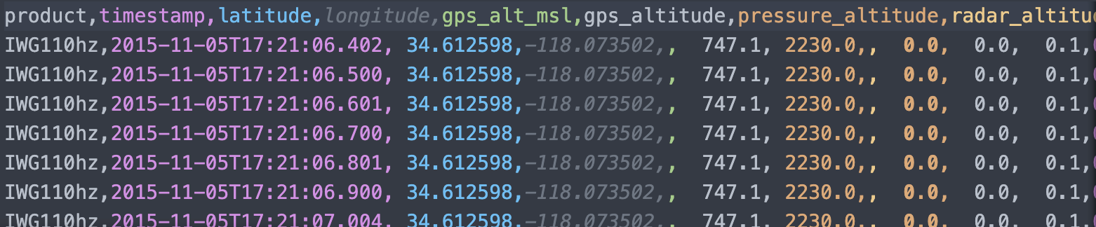
Fig. 2: Example of a text file containing navigation data
Balancing precision and visualization performance
To improve the data loading and visualization performance in the browser, we applied a simplification algorithm to the flight tracks. Airplanes fly very long durations, and having a data point for each second results in a giant amount of data. The simplification algorithm reduces the number of coordinates while preserving a very high precision, roughly the scale of a city block.
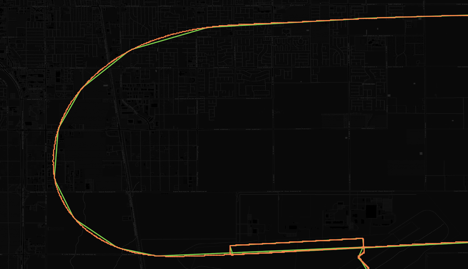
Fig. 3: The orange path (points very close together) represents the plane's position at each second during the flight, which ends up forming a rounded and smooth line. The green line is the result of the data simplification process. They look almost identical, but they are points connected by lines that increase performance without compromising the overall path.
First Round of Maps
Initial mockups were created to guide the placement and overall look and feel of the flight track map within CASEI. To make the information as accessible as possible, we opted to integrate the maps into campaign pages where users could filter the flight tracks by deployment.
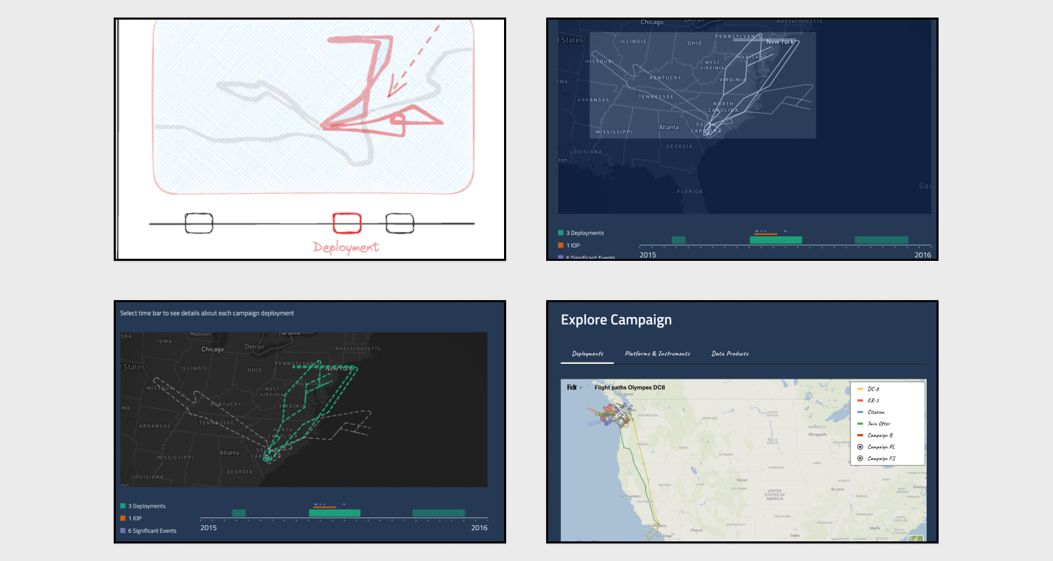
Fig. 4: Drafts of initial sketches and mockups before we had the actual navigational data. The bottom right image shows a screenshot of a Felt map where the first dataset was plotted.
To provide users with more options for viewing the flight tracks, we added a map legend that allows users to filter by platforms.
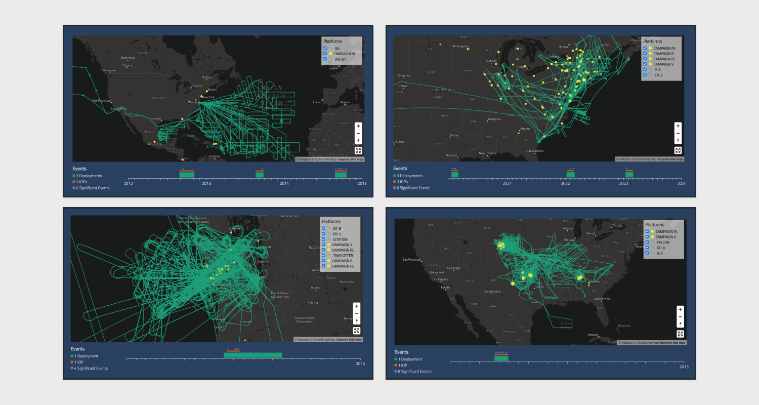
Fig. 5: These are some examples of flight track maps for the Hurricane and Severe Storm Sentinel (HS3) campaign, the Aerosol Cloud meTeorology Interactions oVer the western ATlantic Experiment (ACTIVATE) campaign, and the GOES-R Post Launch Test (GOES-R PLT) campaign.
Ongoing Refinements
Our ongoing efforts to visualize NASA's airborne and field campaigns on the web aim to enhance accessibility and usability for researchers and scientists. By refining the data pipeline and improving the visual design, we strive to make the CASEI interface an invaluable tool for understanding and utilizing airborne campaign data. As we incorporate user feedback and scientific input, we remain committed to optimizing this resource to support the scientific community in addressing critical Earth science questions.
Learn more about our work with NASA IMPACT on CASEI here.
What we're doing.
Latest